Week 7 - Learnings From Rural Bihar
Week 7 - Learnings From Rural Bihar
The grand scale of the public health system in India, understanding the other side of taking designs to field, breaking assumptions and becoming a better researcher.

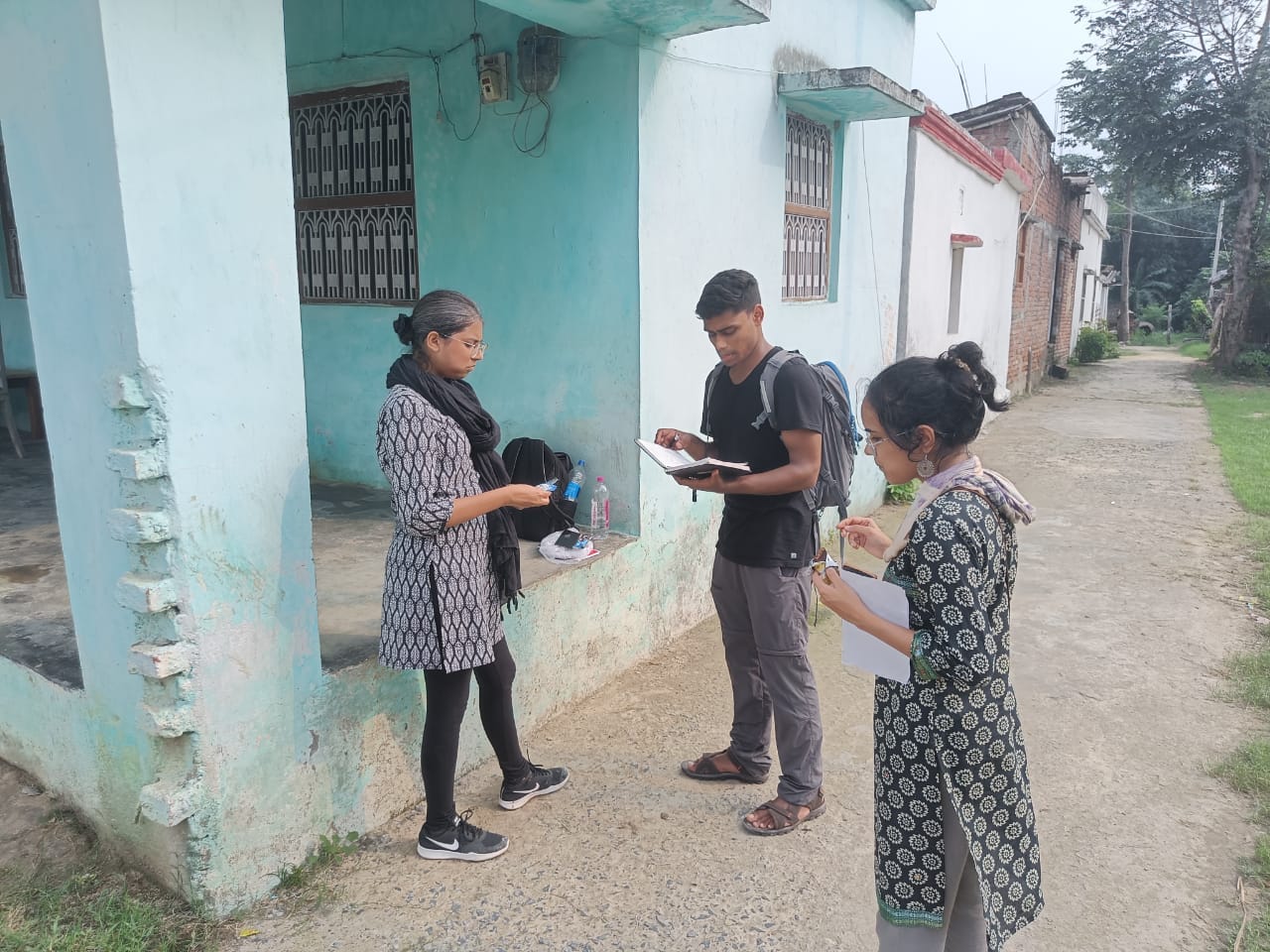
Most of my last week was spent conducting research in two blocks of Darbhanga, Bihar. At TinkerLabs, we’ve been working on a project to try and meet the unmet contraceptive needs of young women with migrant husbands.
The purpose of this visit was to build upon ideas, initially developed over two years ago, by taking them to the field and obtaining a system understanding of the ecosystem in which the solutions would operate.
This week’s post summarises my learnings from the field trip.
The scale of it all.
India ranks number 2 in terms of population, soon expected to be the most populous country in the world. 65% of the population still lives in rural India (Worldbank Data).
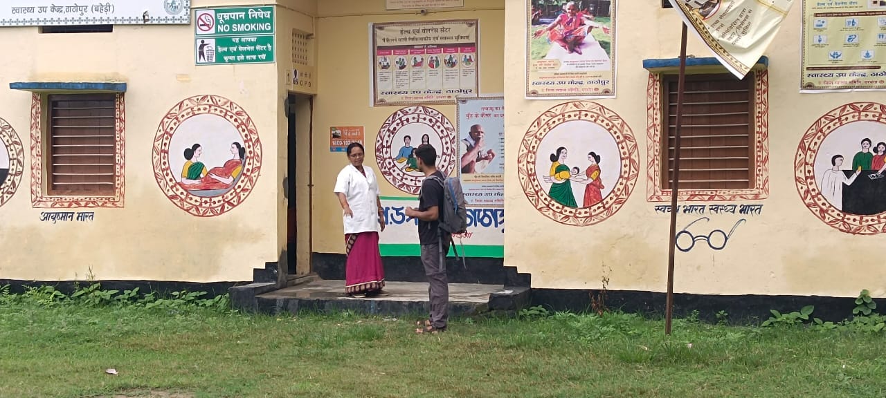
Just to give you some perspective of what this means, let me explain some parts of the public health system. ASHAs are a group of community health workers employed by the Ministry of Health and Family Welfare. They are one of the most trusted sources of medical information in rural India and part of their job includes visiting each house in their allocated area to check for pregnant women and kids <5 years of age to help them with vaccination and other amenities.
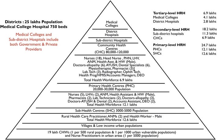
Each ASHA has approximately 250 houses allocated to her. This means approximately 1000 people, living in one of 3-4 clusters of houses (informally known as tolas). Currently, there are approximately 10,47,324 active ASHAs. Each ASHA, at the time of writing this article, has 61 responsibilities that she undertakes. The catch? None of them are paid, but simply incentivized.
As we dived deeper into the public health system, we realized just how big the public health system in India is; and how nearly impossible it is to bring about change, owing to the scale of the problem.

Understanding the other side of the coin.
Part of my grand realisation on this trip came on my flight back to Mumbai.
When one completes four years of design school, '“making desirable solutions for users” becomes a rote-learned answer for most of us. Where our understanding lacks, sometimes, is that there’s another equally important side of the coin; complete with its own set of problems.
If the public health system of the country is so vast and complex, solutions can’t just be brought about keeping the end user in mind. The perfect solution must fit into the existing systems and processes while maintaining its design aspirations. Striking a balance between user desirability and system feasibility is much needed for solutions to sustain in the long run, especially if designing for social innovation.
This involves a whole other design sprint; almost as if you’re solving the same problem twice: once with no limitations (user-driven) and the second time with real-world restrictions (existing system).
Nothing can be taken for granted.
One of our ideas that had to be tested involved a map and, therefore, the user had to be equipped with the ability to understand a top-view map such as the one below:

Fairly simple, right? Most of us in cities are able to identify, comprehend and use such maps on a daily basis. When I sat down to try and get an ANM to show me her village on Google Earth, I promptly understood that these kinds of maps are still foreign to a lot of people.
Upon further observation of their behaviour, while trying to use the map, I realised that a lot of factors (that I had assumed would be simple) were simply too complex. Translating a 3D environment to a flat 2D visual, the complete loss of direction (due to the nature of 360-degree vision on Google Earth), alien gestures to navigate the phone screen, etc.
These skills are so ingrained in modern-day society that we use them every single day without ever realising that these are actual skills, developed over continuous use of seeing things a certain way. While this kind of map works extremely well for us, it isn’t the only way.
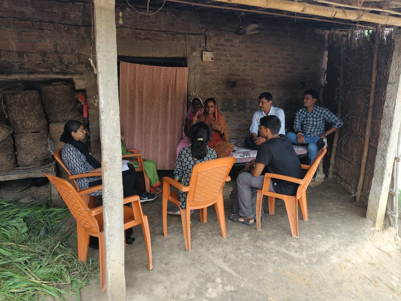
Ravi started iterating on the go and, thanks to that, we realised that illustrated maps that clearly depict landmarks work better for them. Scale and proximity were secondary factors, identifiable landmarks were number one.
Be careful, dear researcher.
Throughout the trip, I keenly observed everyone around me and reflected on my own research practices. I realise, now, that the responsibility of a researcher in the field is immense and subject to our human frailties.
You see, I realised that it was very easy for any one of us to fall prey to confirmation bias: the tendency to interpret new evidence as confirmation of one's existing beliefs or theories. When questions only seek to validate a hypothesis, there are chances of your design research being considered null & void because, in order to confirm or negate a hypothesis, you’d ask a somewhat leading question. A leading question gives rise to untrue answers, which then skews your data and pivots you (rather catastrophically).
In projects where the time of external stakeholders is involved, ensure that you are prepared and have vetted your list of questions rather critically. One leading question gives you wrong data and wasted time with an important person that you will never get again.