Week 37
Week 37
Thoughts on discipline, a font made by driving, Zach Lieberman, being more in tune with my feelings, the Redaction typeface, making a poster interactive, the elusive macro picture & Hershey Fonts.

It is 9:15 am on a Tuesday morning as I sit here frantically typing to wrap this up, grab an apple and head for work.
I spent my time on Sunday doing something else. Initially, I felt guilty for not doing something that I was supposed to do (write this post). However, I have realised that I want to write every week without it being a binding activity. I don’t think that discipline should be a box that you can operate within, but rather a scaffold to support the chaos of daily life.
[Projects] iQ Font – A font made by driving
This past week, I came across a project that Zach Lieberman was involved in which involved the creation of a font with a car.
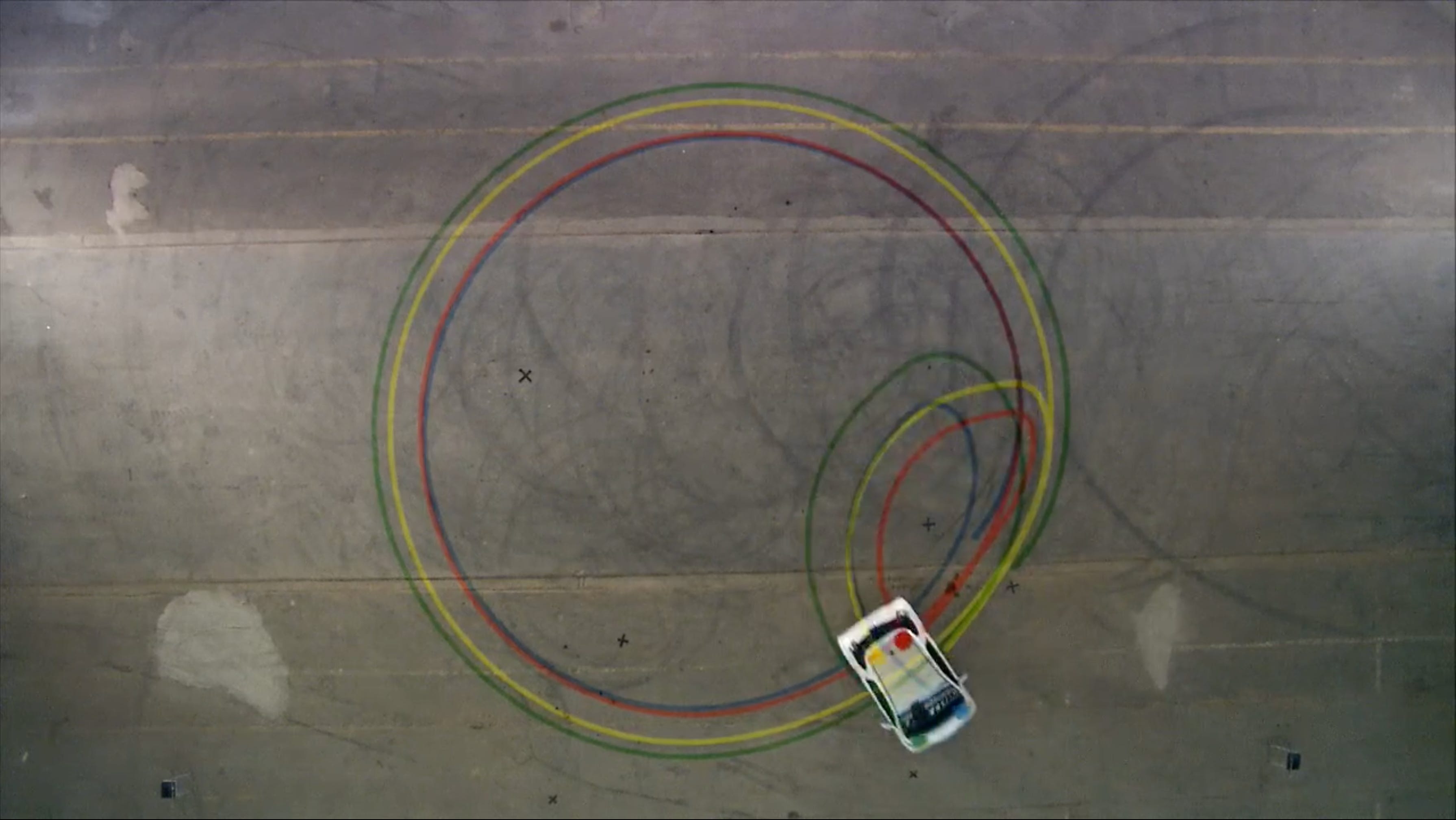
The project basically involved a car with colour spots on top of it, that were then tracked by an overhead camera. The person driving the car would be instructed to move a certain way and the data was then used to drive the creation of the actual font.
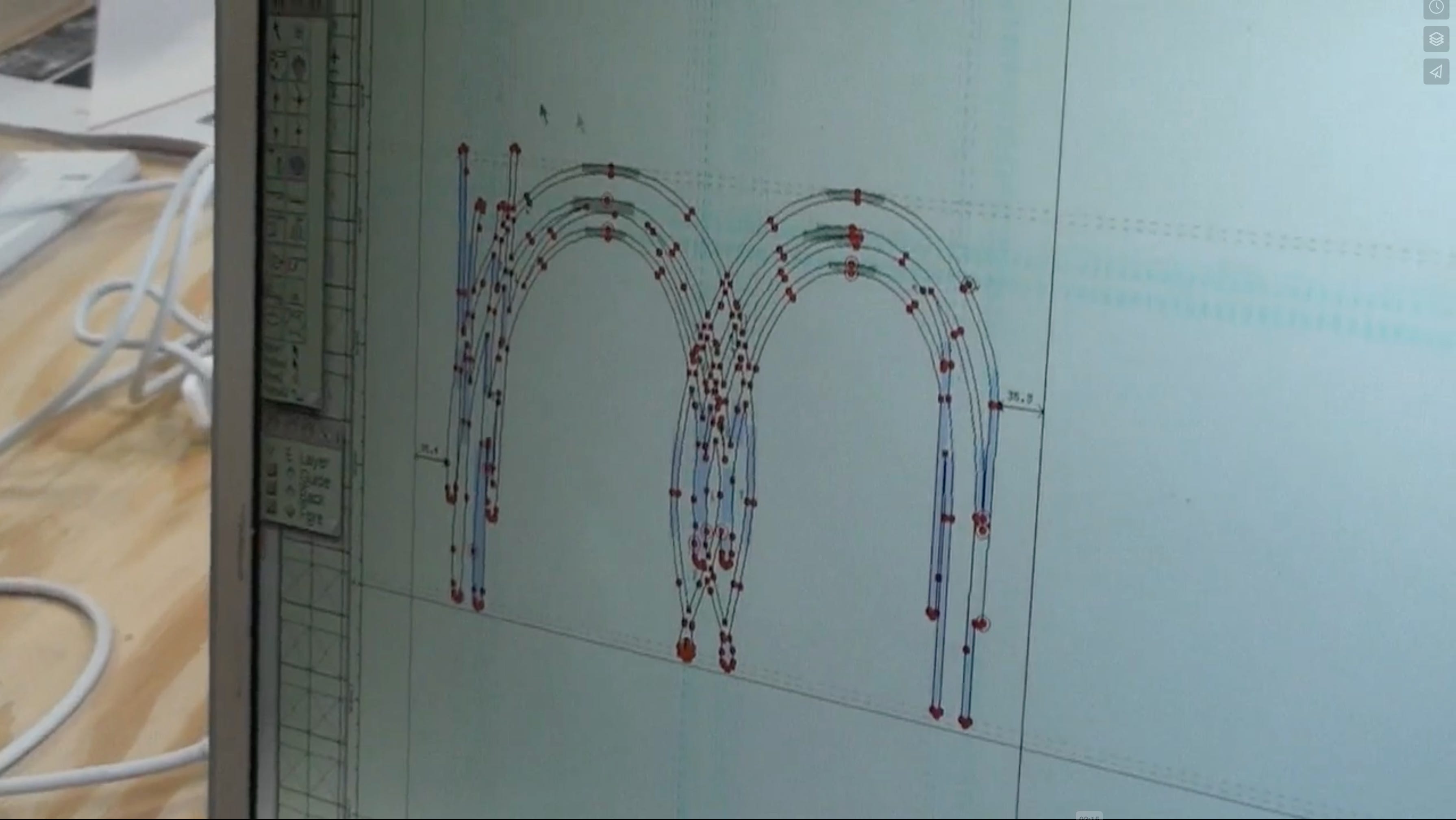
What I found interesting was Zach’s approach to the problem, as the interactive artist in the project.
When I saw the ‘making of’, I saw how simple the program was that Zach created. It essentially involved colour tracking and he included a bunch of overlaid user-selectable options to better see the data generated by the moving car.
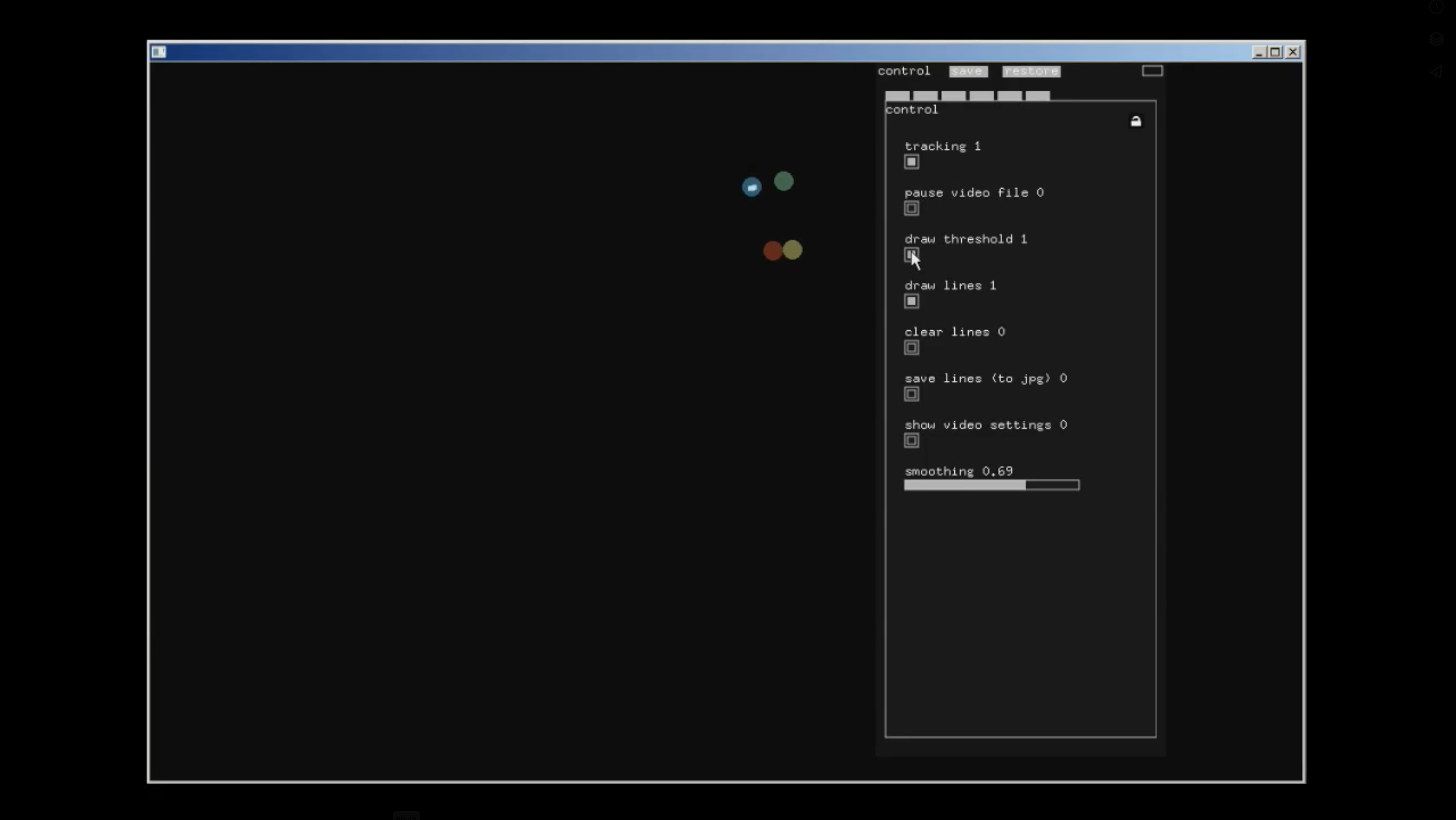
Interestingly, colour tracking is something that I myself had gotten into a while back.
It’s fascinating to see that, sometimes, such a complex project can be solved with a rather simple solution. It needs to work not be fancy, which is something that I had wrongly expected in the making of video.
[Reading] Going down a rabbit hole of Zach Lieberman
After going through the project mentioned above, I became even more interested in Zach Lieberman. Of course, like many of the people who begin creative coding, I knew about Zach. He’s a celebrity in our circles.
In the process, I came across this fantastic read from 2016 which explains his daily (creative coding) sketching practice. In the extremely elaborate article, Zach explains the thought behind the year-long project, his process, his journey throughout the year, his evolution of concepts and his takeaways from the same. Here are two passages that I found to be quite special:
My step-daughter was having trouble falling asleep by herself at the time and so I would hang out in her room, read some books and then as she tried to sleep, I’d code a sketch and in the morning show it to her. At the beginning of the year she was really positive, “that’s hypnotizing me!” but after a while she started to offer more criticism, “you should try color” or “that looks a little too crazy to me” She pushed me in different directions. I was happy to show her that art making is daily work and small discoveries.
"It’s interesting to see when I have an idea that I really love that doesn’t connect with people or when there’s something people pick up on that I don’t think as highly of. A lot of times, as an artist, I feel like we’re struggling to find our frequencies and what resonates with the frequencies of the world. This act of sketching is a kind of tuning of these frequencies, trying things that are more harmonious, trying things which are more discordant and generally getting a feel for how others see your work."
The second passage is something that I connected with instantly. I have been there, time and time again and it felt really good to know that someone (well-recognised for their work) sitting miles away from me feels the exact same thing. Maybe humans are more similar than I thought; a kind of global umbrella binding everyone within.
I then moved on to observing Zach’s daily practice and how it has grown since 2016. One can clearly see him reusing old work, giving new meaning to old ideas which is something that I haven’t yet been able to do. I always move on to create a new thing altogether and never feel like messing around with something that I had previously created.
Could this just be a result of time? Do something over & over again and you are pushed into a space where you’d like to make tiny tweaks to something and get out of there. Or could there be a more fundamental difference between me & Zach?
I don’t know the answer yet.
[Experiences] Being more in tune with my feelings
Since my realisation in Week 36 about Having conversations with I Feel Like, I experienced an interesting incident.
One day, someone texted me something nice about my work. I wrote down the reply and it contained the phrase, “I feel like _____”. Whenever I have begun a sentence with that phrase, I almost automatically hit send with whatever feeling I write in the first go. There’s never any doubt with regard to my feelings; if I have opened up enough to tell you how I feel, that is an emotionally evolved response altogether.
However, this time, I backspaced and changed the feeling because I knew that the new feeling was true-er in a sense. It felt like I had originally written an umbrella feeling, something like ‘nice’ or ‘good’, and then replaced it with something finer and more accurate. I could feel myself going a layer deeper in the process as if I had originally responded via my surface.
Maybe I’m an iceberg by myself.
[Cool Projects] Redaction Typeface
I came across the Redaction typeface by Jeremy Micklel while searching for fonts with inktraps.
The case study on their website is extremely well written.
[Conversations] Get the macro picture to manage expectations & energy
This past week, I had a yearly reflection meeting at work.
To be honest, I was a little disappointed with the work that I was doing since I couldn’t see what it was all leading to. In my past projects, I’ve almost always gotten closure; made outcomes that I could see people interact with. However, in the world of social innovation, for something to reach the hands of people requires the magical alignment of a bunch of different factors that are not in the hands of the maker.
I don’t think I can expect the same things that I got from smaller-scale or independent projects. Realising this might help me to better manage my expectations & energy at work. I need to stop treating it like a college project, doing everything possible to make it a groundbreaking one.
The world outside requires you to be a little more patient, calm and strategic. I believe I can pull it off professionally since I have my own creative practice that requires me to be nothing else but myself.
[Experiments] Everchanging letter grid
Last week, I came across the “amor” poster by Flavia Menezes for the exhibition: The World In You.
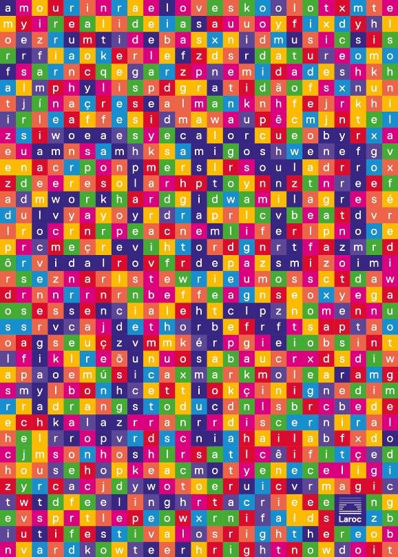
When I first looked at it, I wondered how incredible it would be if the letters would change over time. Inspired by the work of Stig Møller Hansen, who takes graphic design outcomes from the past and rebuilds them using code for a class he teaches, I decided to take the “amor” poster and build something interactive as well.
It was so fun to create this, especially because the structure in my head was so clear (since this was an object that I was replicating and not thinking of originally). Each letter is a separate tile by itself which contains the space to display a letter. Every time that the mouse moves over a tile, it changes the letter as well as the colour of the tile.
This is the first time that I’ve used a palette of colours in a creative coding output. I think I’m going to do that a lot more.
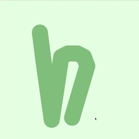
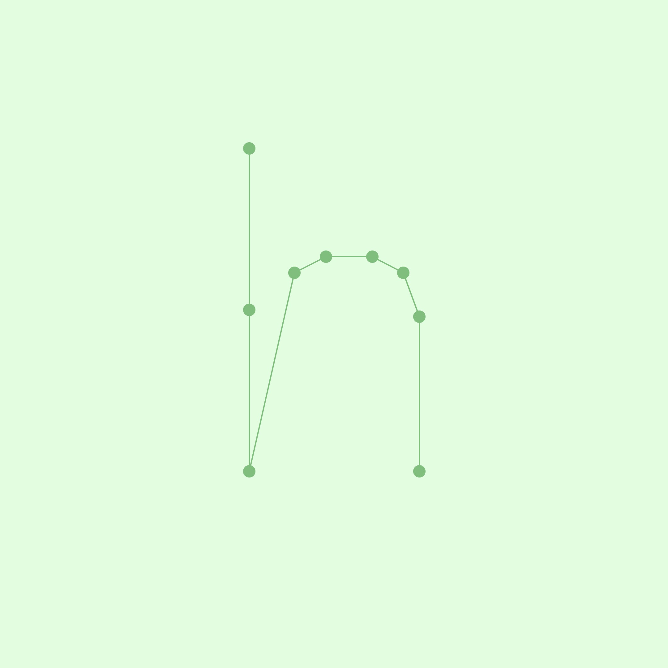
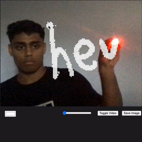
[Learnings] Hershey Fonts
While going through some of Zach’s work (as I previously mentioned in this article), I came across Hershey Fonts developed by Dr. A.V Hershey.
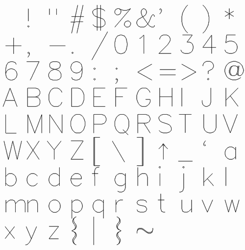
What’s special about them is that these are written as vector coordinates and the system for doing so is incredible. Here’s an example of how ‘H’ is written:
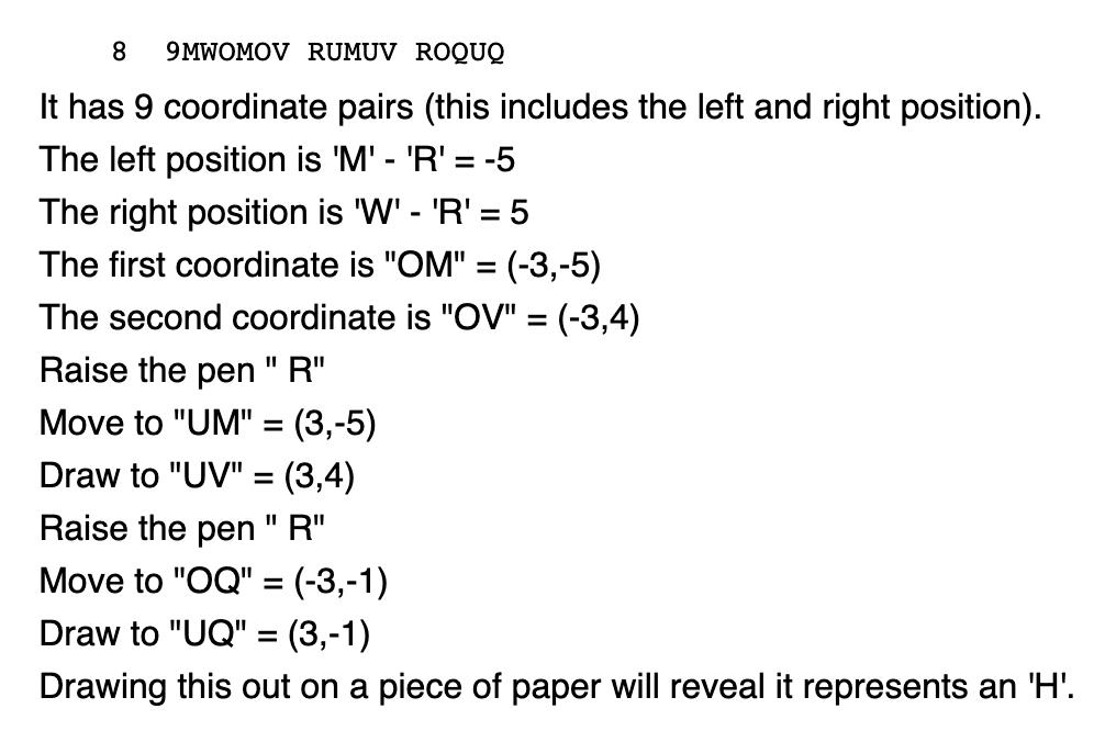
Although these were originally invented to be rendered on early cathode ray tube displays, they find themselves back in modern culture in the world of creative coding. If fonts are simply coordinates on a screen, one can easily write programs for computers to manipulate the letterforms.
I tried to mess around with it but can’t figure out a way to actually call the coordinates from the source file for p5.js. I did, however, trace a Hershey Font letterform on Illustrator and used the coordinates on p5.js to mess around with the letterform.