

Week 20
Week 20
Making some shifting type, Indra Kupferschmid’s font pairing matrix, Ivan's Sketchpad program, particles that come up when you flush, Ralph Ammer's blog and gauging emotions with a webcam.

[Experiments] Finishing shifting type and understanding how not to fall in love with your work
Last week, I was reading up about easing functions in an attempt to build my constantly-shifting-typeface. This week, I decided to close out the project.
I’ve realised that, sometimes, you may take a break from a project and return with a fresh perspective. That fresh perspective may require you to build the project again, from scratch. This throws us off. We are more likely to try and morph the fresh perspective so that it can be an add-on, something that you could include in the work already done and build up from that even if that isn’t the best option.
I think we tend to get a little lazy at times. So much effort has already gone in, why start again?
I like how programming has allowed me to start afresh. If you’re making a complex system, like this shifting type one, you need to start again in order to include any changes that you might make. Each computer program is written as a set of rules, in order. Even a minute change leads to a restructuring exercise and you’re forced to put the new steps in the correct order.
When I duplicate a file that didn’t work, delete everything in that file and begin again, I find it so liberating. Didn’t work? Scrap, cut, save what did and begin again. Do this until the steps are in the perfect order, so that they make what you intended them to make.
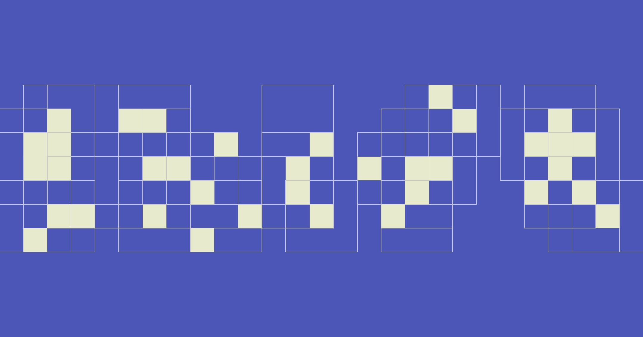
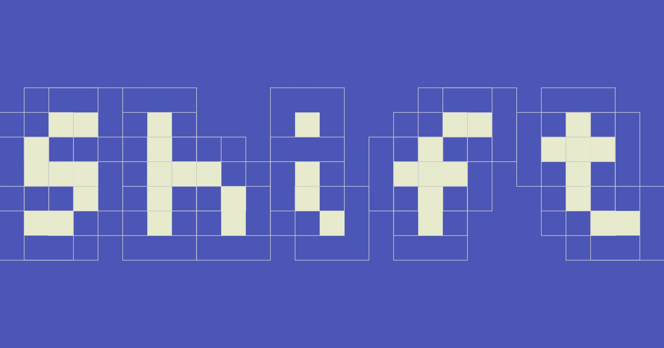
The new shifting type algorithm works on the same starting concept as I discussed in my earlier post. Every 5 seconds, the program dictates a new position for each pixel and the pixel lerps (forms a bell graph in speed) from its last position to the new one. I also added an ‘order’ button to bring the pixels back to the letterform shape if clicked.
You can view the video here:

[Articles] Indra Kupferschmid’s font pairing matrix
Came across this article while reading Elliot’s final Google Fonts Knowledge drop of 2022.
Pairing fonts has always been rather ambiguous. Given the larger buckets of genre classifications, like the classic serif vs san-serif, leaves us with a bunch of typefaces to choose from and we usually rely on visual aptitude to pick out the best ones.
In an article written by Oliver Schöndorfer for Google Fonts, he expands upon a ‘font matrix’ based on the work of typography professor Indra Kupferschmid. She suggested a three-layer system: skeleton (the base model), flesh (thickness and serifs) and skin (finer ornamentation done on a letterform).
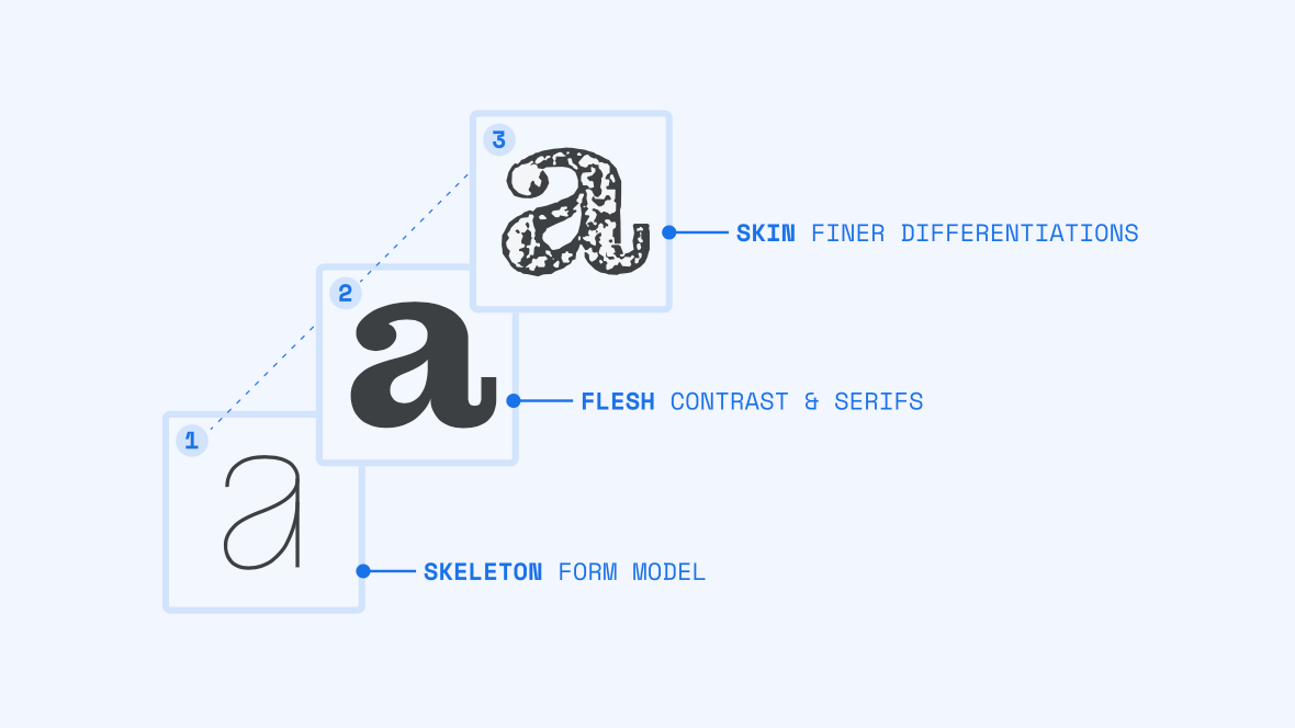
When you analyse the skeleton of a typeface, you can understand whether the form is meant to be dynamic, rational or geometric. All 3 give rise to different feelings when you look at the letterform.
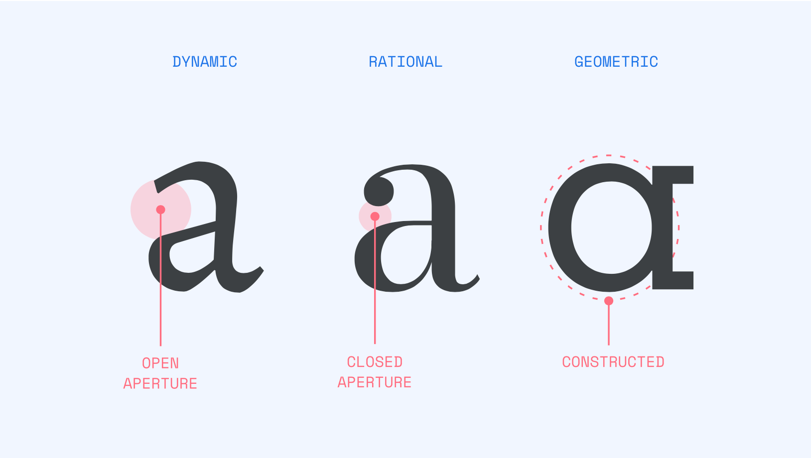
Next, you could look at the flesh of the typeface. Here, you can analyse the amount of contrast that exists and whether the letterform accounts for serifs.
Finally, you could move on to the skin. What are the finer differentiators in the letterforms? Do they have thorns or decorated serifs? The skin usually takes a lot of attention from the viewer.
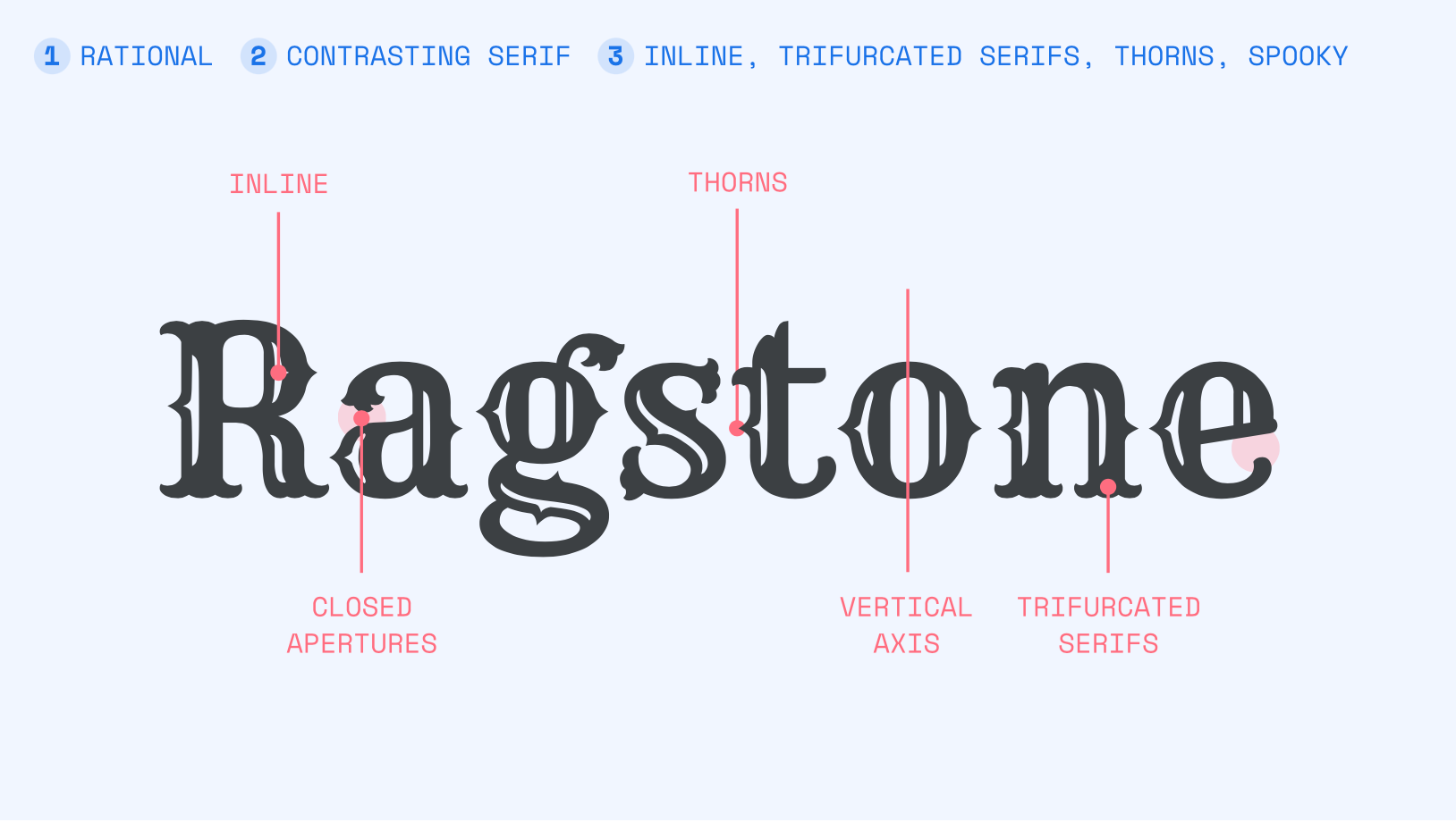
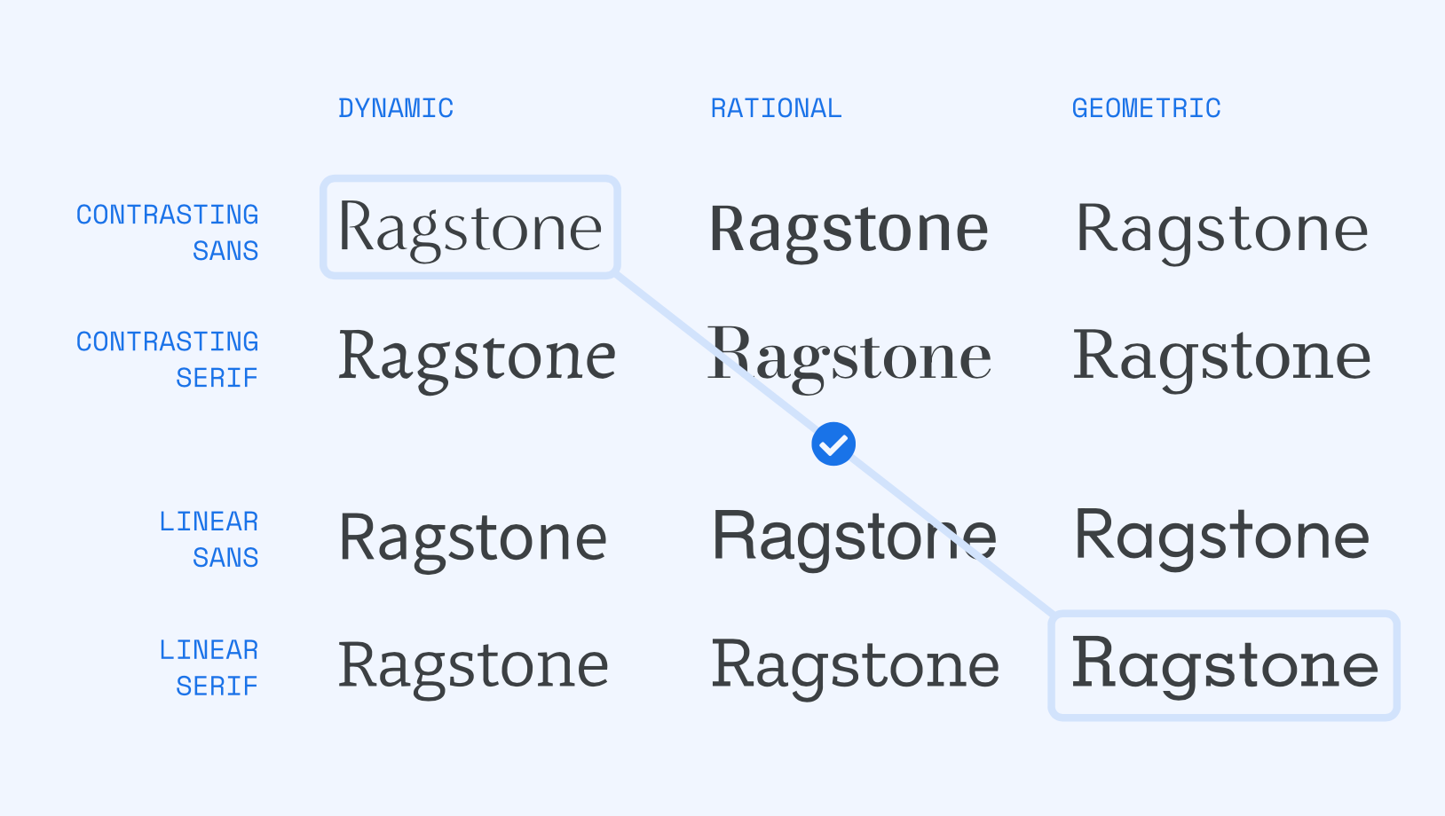
What you would then have are parameters for each font. Is the font heavily contrasting but sans-serif with a geometric construction? Or is it a linear serif font with a rational construction?
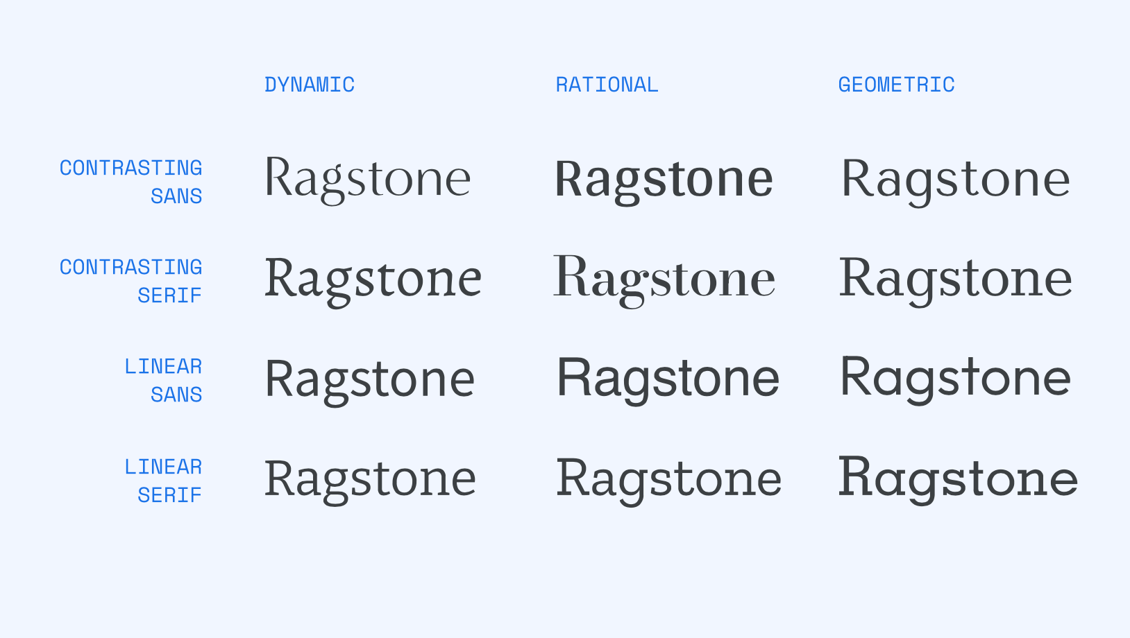
You could then make different combinations from this list, depending on the amount of contrast you want in your selected typefaces.
[Projects] Ivan Sutherland’s Sketchpad
While reading up about Inkbase, a ‘programmable’ ink made by Ink & Switch, I came across Ivan Sutherland’s 1963 thesis project at MIT.
His project was called Sketchpad which, turns out, is one of the most influential computer programs ever written.
Sketchpad allowed users to draw anything on the screen with a light pen, enter some rules for the shape or lines being drawn (like for example: make it parallel) and the computer would then do that for you. The project marked the birth of graphical user interfaces, a concept without which much of modern day computing would not exist.
I really enjoyed his original paper as well. In his abstract, the first few lines expand on such a wonderful simplistic definition of computation. He writes, “The system contains input, output, and computation programs which enable it to interpret information”.
And that’s it, isn’t it? Computers take in input, interpret and perform operations and result in an output. That’s supposed to be it and yet the medium is misunderstood as highly technical, complex and mundanely machine.
[Cool Things] Gauging emotions through a webcam
Very cool explorations by Ismail Ari of the Perceptual Intelligence Laboratory at the Bogazici University. He explored real-time facial expression recognition using a webcam.
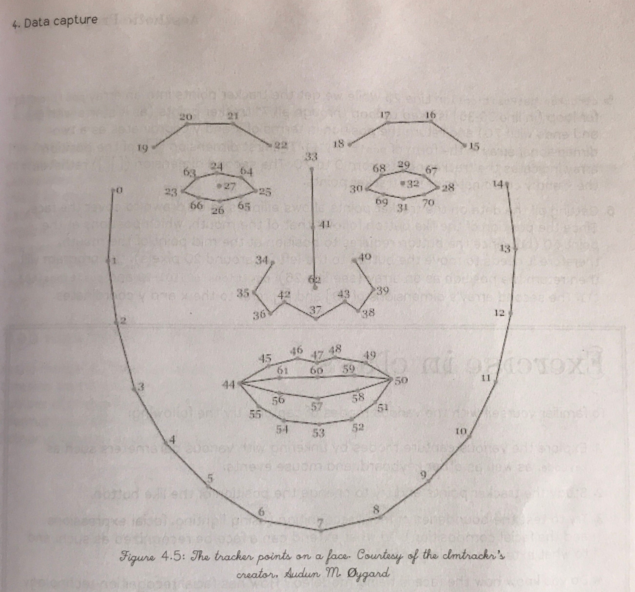
I don’t fully understand how this happens but I’ve been exploring some facial recognition myself too. What I understand till now is that the face can be divided into a bunch of points which you train the computer to recognise after you feed it thousands of human faces with these points mapped onto them. Jason Saragih and Simon Lucey had designed a facial algorithm model which divided the face into 71 points, as shown below:
I assume that you then look at different relationships between the points. If the eyebrow points rise, pupils become bigger, the upper lip rises, the lower lip falls, the left cheek moves more to the left and the right more to the right, it would mean that you’re shocked and probably making some sort of a gaping face right now.
[Cool Projects] What comes up when you flush
I just loved the wacky nature of this project. In a “free week in June”, researchers at the Ecological Fluid Dynamics Lab at CU Boulder decided to see the impact of flushing the toilet with the lid open.
They set up lasers and some particle measuring devices near a toilet and saw just how many particles come up when a toilet is flushed.

When you see it, you can’t unsee it. I think it’s time to start closing the lid more often.
The original article which explains the science can be found here.
[Cute Website Design] Ralph Ammer’s Blog
I came across a rather cool article by Ralph Ammer on How to draw ideas. While the article is a good read as well, I especially enjoyed the nature of his website.
He uses hand drawn GIF animations to explain ideas and also uses them as thumbnails. They’re very simple, black lines on a white background, with the same stroke weight every time. His blog isn’t a dump of ideas, but rather a collection of carefully developed ones.
Really enjoyed his style. I wonder when people decide that this is the style they want to stick to, for a long time for their lives. A rehaul of his website would be so cumbersome and, because of that, he’s stuck to his way until he finds the courage to do something new again.
I wonder when that level of convictions comes and whether that conviction restricts you or structures you. Or both.