

Week 19
Week 19
Easing functions, thoughts on Design Systems, data driven world cup posters, a responsive grid generator, an interactive map of the universe and a platform to generate graphics.

Quite a packed week. Had a lot of work, a bunch of learnings, some interesting thoughts and said goodbye to November.
I can’t quite believe 2022 is coming to an end in 27 days and, with it, my side project of creating a film every month. It’s been one of my longest self-sustained projects and I’m happy to have made it this far. I’ve been thinking about 2023 quite a bit and hopefully, as this month progresses, I’ll have a better idea of the side projects that I wish to take up next year.
Anyway, too far into the future for now, time to get back to the learnings of this week.
[Learnings] [Experiments] Easing Functions
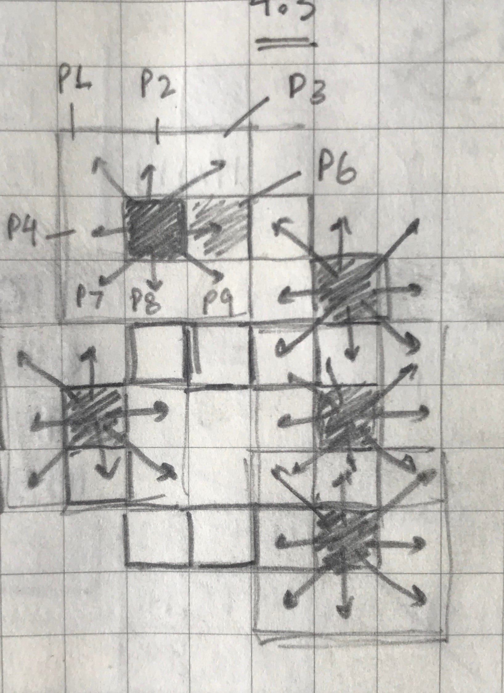
I’ve been working on trying to create a constantly shifting moving typeface. The plan is to first take an existing pixel typeface as my starting point.
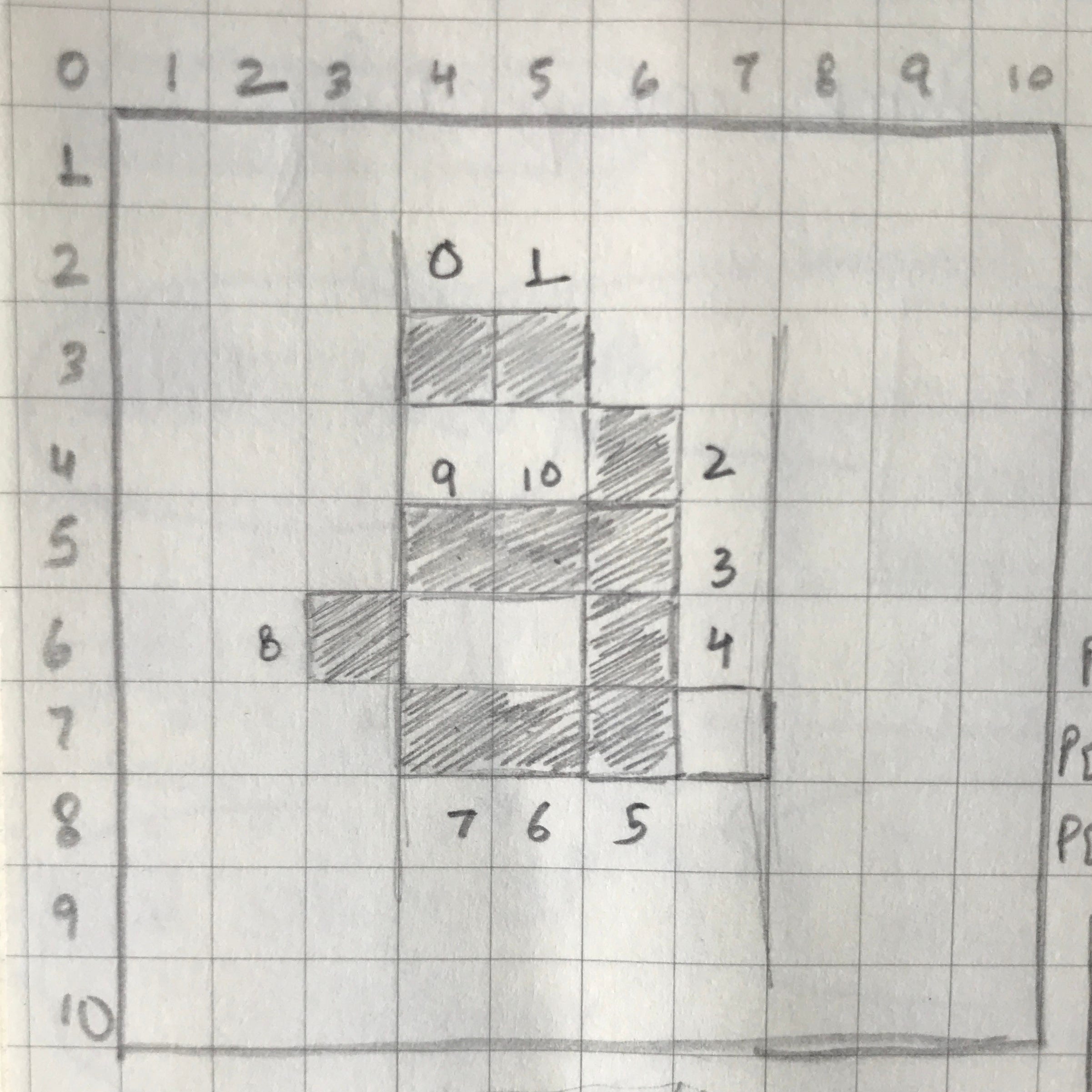
Each individual pixel then has 9 possibilities to move to, which would result in a slightly distorted but still recallable letterform shape.
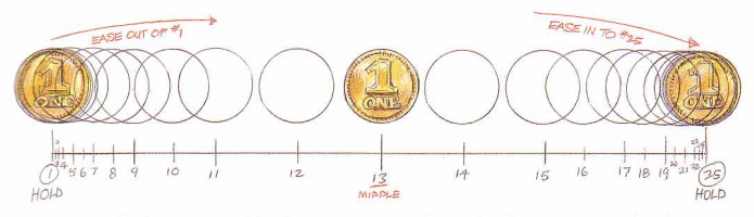
In order to smoothen out the movement, I started reading up on easing. Movement without easing exists in a linear way, i.e something moves from point A to point B because of a fixed force acting on it.

However, physics doesn’t work that way. Objects in the real life have many different forces acting upon it that ultimately lead to movement being faster in some places and slower in others. Easing, as an animation principle, is something that I’d studied during college as well.
However, if you decide to implement easing in something that you’ve coded, you need to explain easing to the computer in a way that it can understand. While I do not fully understand the math behind it (you can choose to deep-dive here), here is how it works from my understanding.
Say you have an object that moves from Point A to Point B, 1 unit every frame. At time (t), it reaches 0.7 on a linear scale which is x = x+1 for every passing frame.
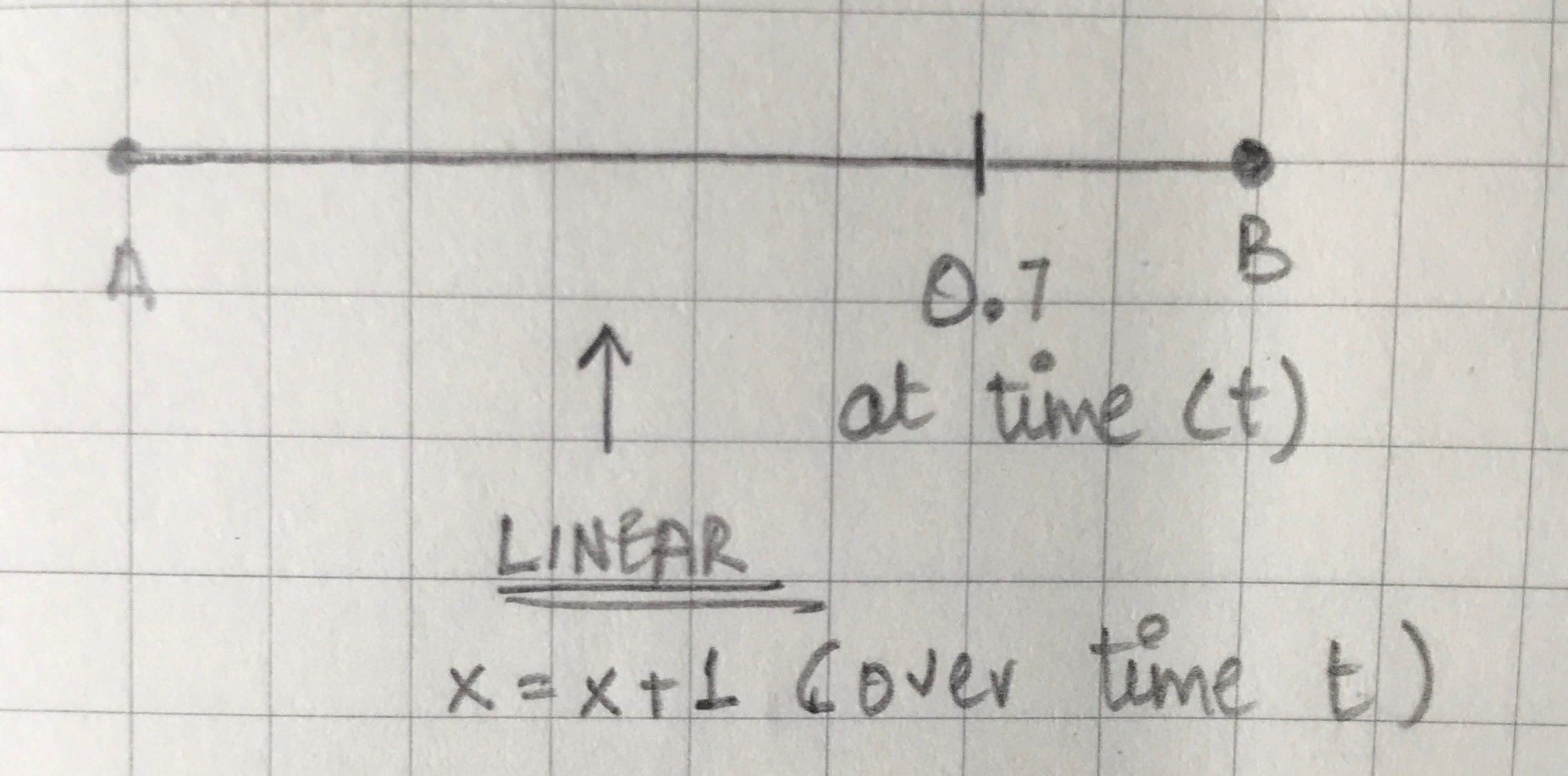
If you were to multiply the value on a linear scale by itself three times (making a cubic scale), you’d get x=0.7*0.7*0.7 which is 0.34. Therefore, at the same time (t), the object if moved using a cubic scale would have reached ~0.3 units.
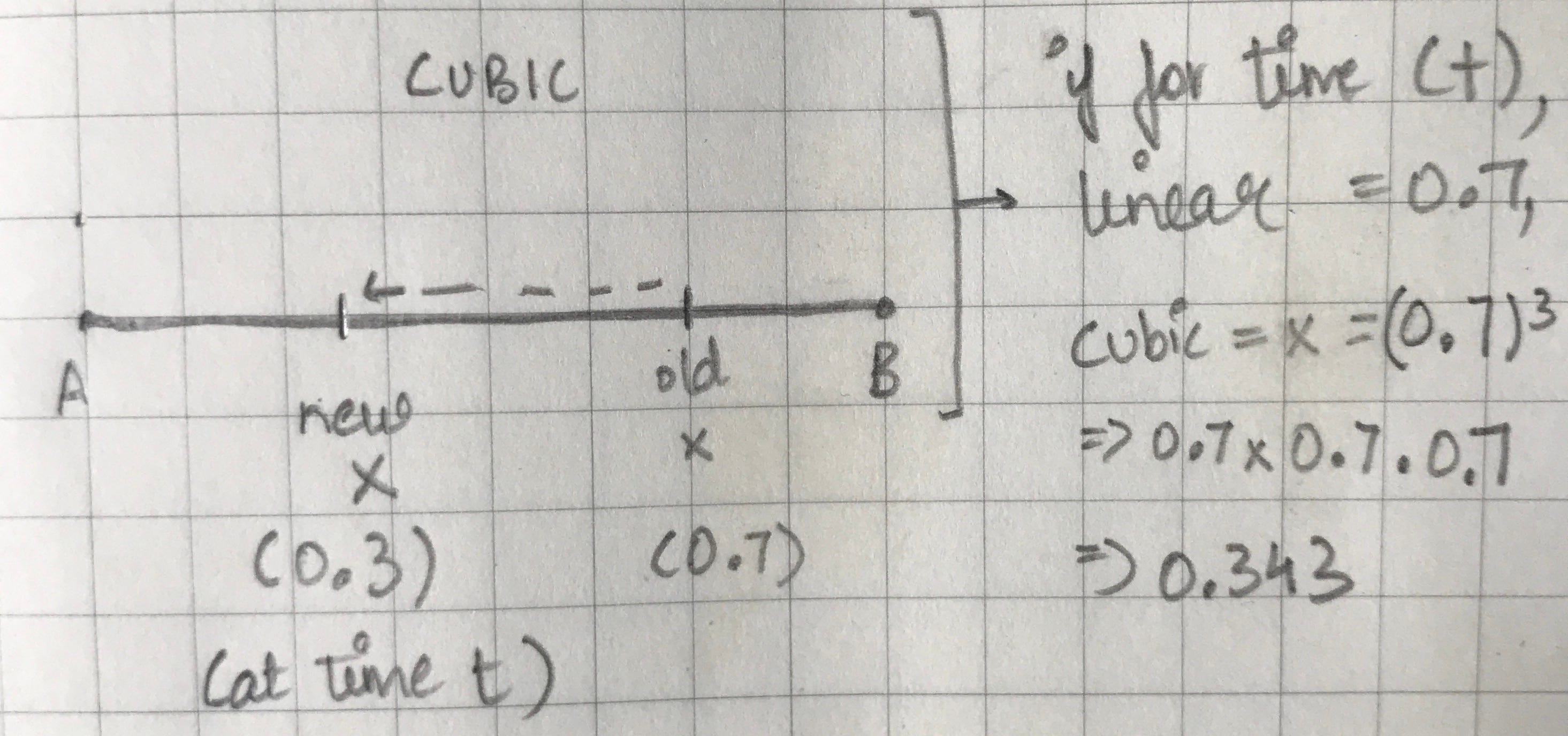
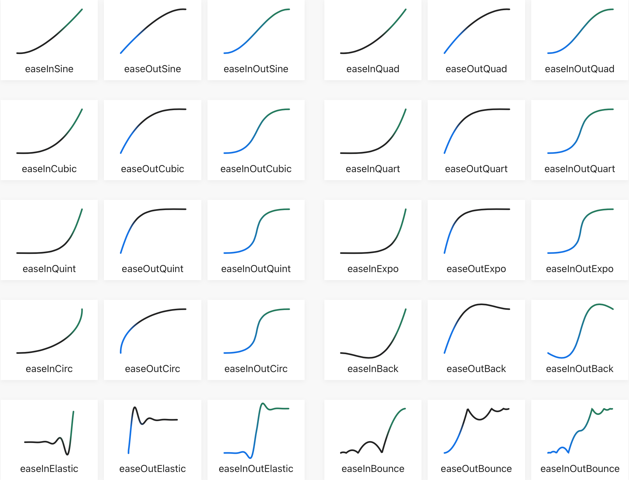
If you then use this scale over a sin and cos graph, it would result in a movement scale that varies over time. A good collection of these can be found on easings.net.
I still do not fully understand the nitty-gritty of this but I hope to make more sense out of it as time progresses. As for the original experiment idea, I goofed up the movement algorithm by not taking time into account and ended up making a jiggly type generator instead.
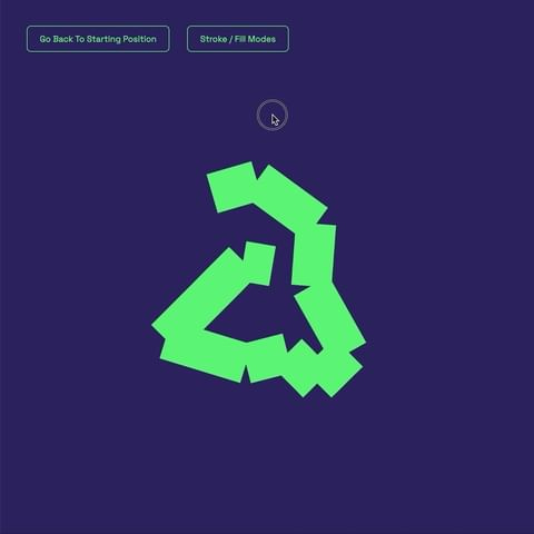
What is happening here is that with every passing frame, each pixel finds a new position (just like I’d imagined) but independent of all the others. This ends up distorting the letter far too much (need to figure out a relationship between each pixel) and too frequently (need to slow it down by moving each pixel after a certain amount of “wait” time).
[Articles] Conscious Design Systems by Amy Hupe
Building conscious design systems published on Amy Hupe’s blog was quite a wonderful read this week. In the article, she discusses the world’s craze for design systems and how we’ve forgotten to consciously make them. This allows for the mindless practice of following trends, forgetting the purpose of a good human-centric design system and making for the wrong set of users.
An example that I found interesting was how Google replaced traditional input boxes with lines for users to type into in their Material UI Design system.

This meant that android applications and even websites that used the Material UI blindly resorted to these changed input fields, even though designers and developers around the world raised concerns about the obvious affordability issues. Users would be confused because a line does not afford to be clicked on, the same way a button does. As Amy puts it, “but this was Google - so a lot of those people who had concerns, found themselves shouting into the void.”
Clients around the world wanted their input fields to also look like Google, much to the frustration of people who could envision this as a problem. But then again, it’s Google … how can you defy the tech giant and its authority?
Turns out, in 2017 after Google conducted some usability testing, they redesigned the text fields and wrote, “The line affordance under the old text fields was not clear to some users [and] was confused with a divider”. The problem?
Thousands of organisations had already adopted the design and could not follow up on the changes suggested by Google, leading to so many usability issues.
Amy has wonderfully expanded on many other cases in her article and I would definitely recommend it as a weekend read. Another cool article referenced in this one is called Falsehoods Programmers Believe About Names which highlights wrong assumptions about names that are adopted by designers & developers when designing applications/forms.
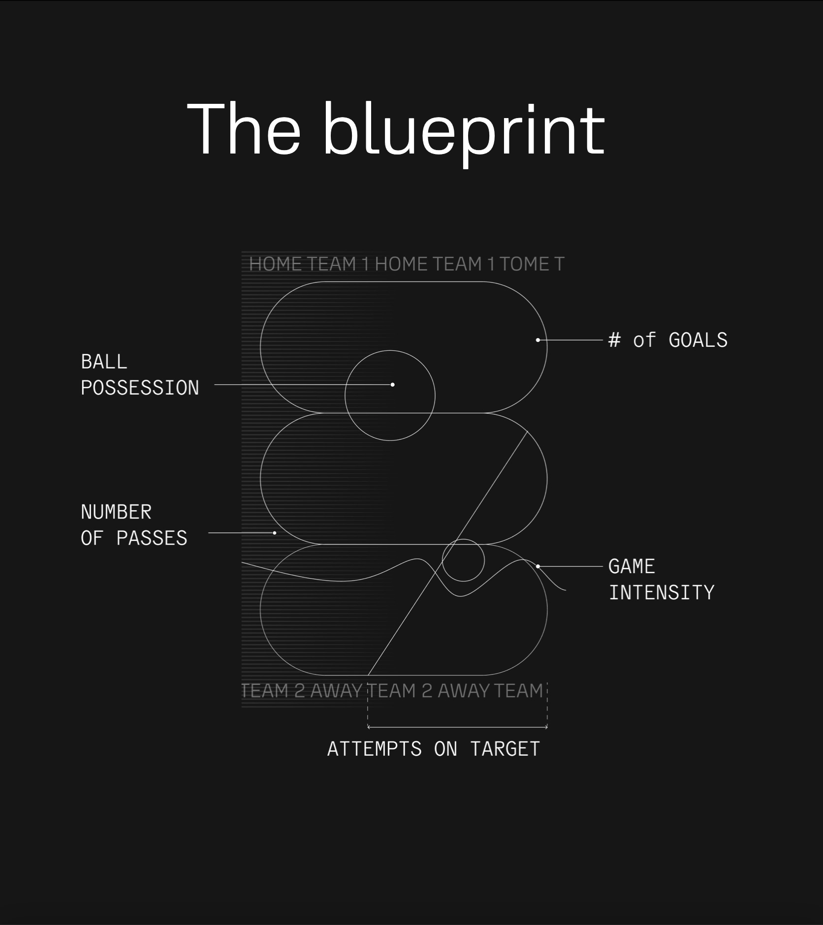
[Cool Projects] Data-Driven Posters from the FIFA World Cup 2022
Found a project called GenCup, a project by Zeh Fernandes and Marco Vincit that creates an abstract composition based on data from each match in the ongoing FIFA World Cup 2022.
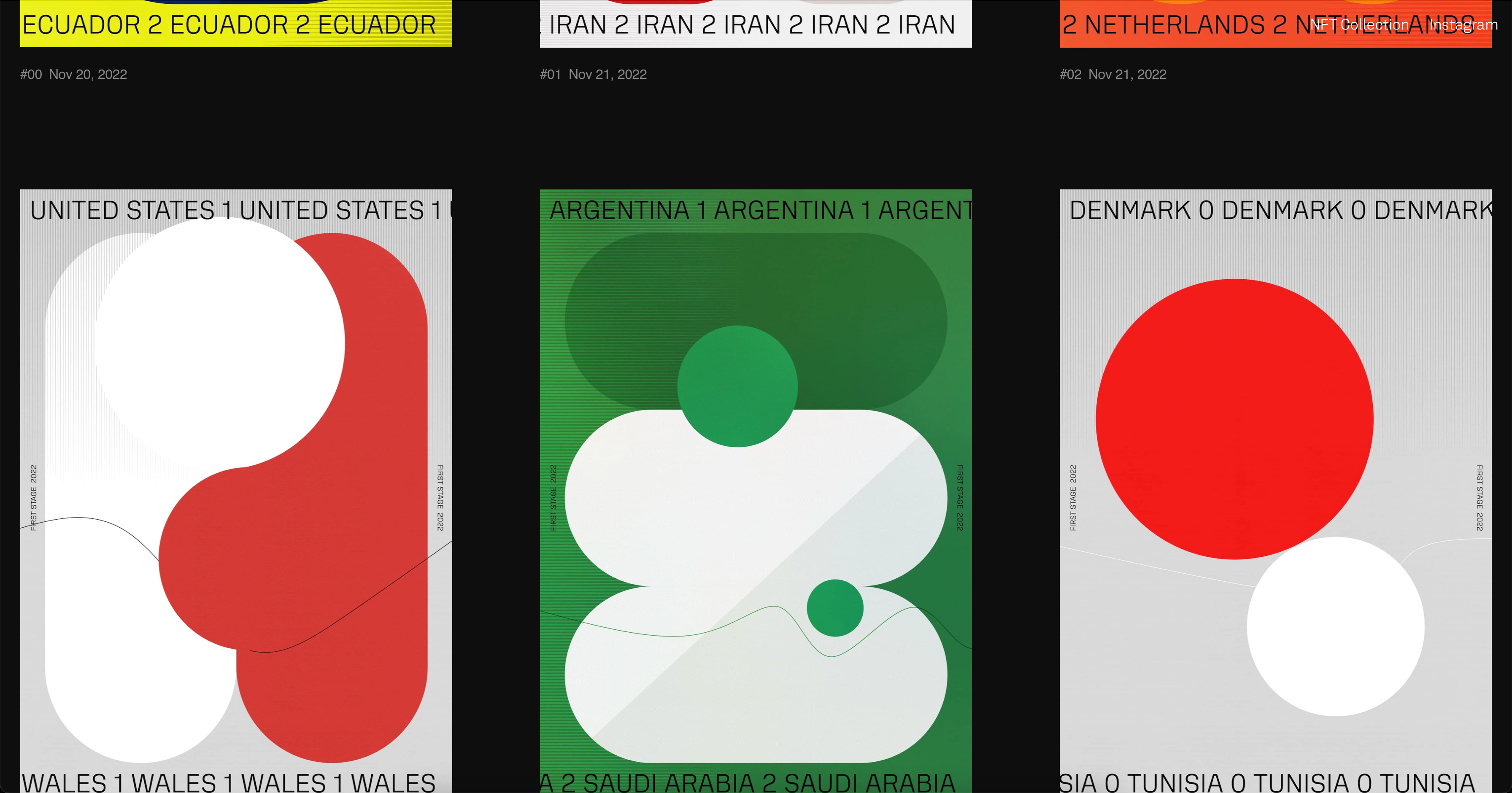
What I especially liked about the project was how they included a “blueprint” for each poster. Data-driven posters are often difficult to comprehend and the inclusion of a blueprint means you can easily make sense of what is essentially an abstract composition.
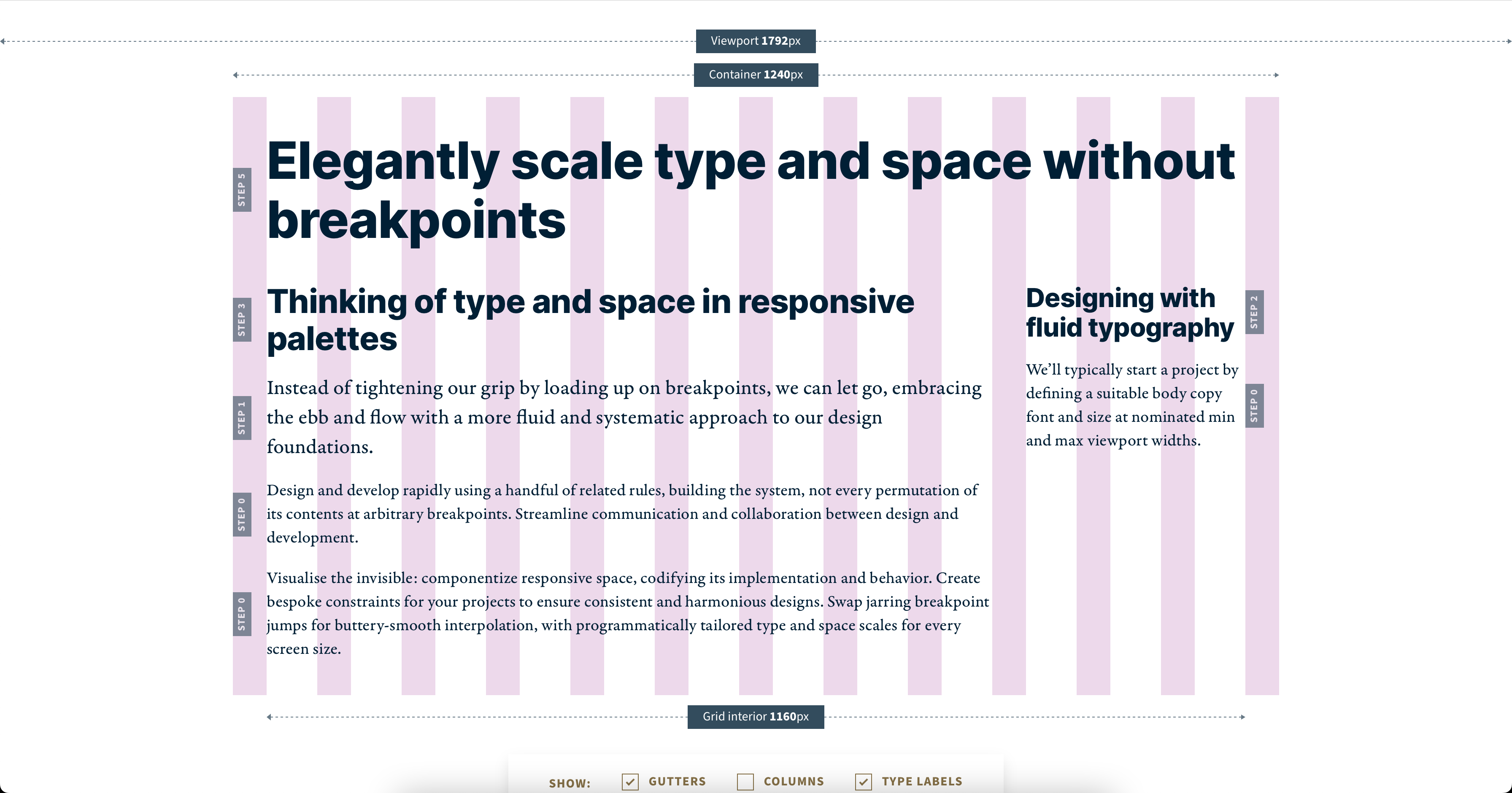
[Resources] Utopian Fluid Grid Calculator
Since I’ve been thinking a lot about my new website, I found this extremely cool resource to generate a fully responsive grid based on certain parameters that you enter.
[Cool Projects] An interactive map of the universe
Astronomers at John Hopkins University have created a map of the universe, that displays the entire known cosmos with pinpoint accuracy. You can view the map here.

In a video explaining the project, the person leading the data visualisation team says, “making the map is not the hardest part since all the data is there, but making a good map is the challenge”. I liked this line.
[Resources] Generate graphics
A cool website to help you generate gradients and patterns.