

Week 15
Week 15
Tree diagrams to design interviews, dialling sounds, neologism, normalcy bias and the different purposes of design for different designers.

This was quite an intense week. Although when you read this article, I shall be away in Bandhavgarh for a TinkerLabs team vacation. Feels strange to not write this on a Sunday morning, post my almost-ritualistic run, but rather on a Thursday night as I delay the impending task of packing.
Anyway, here are my learnings from the first week of November.
[Thoughts] Using tree diagrams to design interviews.
I don’t know whether this is a force-fitted concept because of my computational inclination or whether this actually helped me but here’s a different way to think about planning moderated interviews.
Usually, in user research, you tend to use open-ended conversations in order to acquire certain stories that align with your research questions. For example, in order to understand a person’s morning routine, you’d ask them to take you through their last morning. Their answer would be in the form of a story which you then sit and dissect. When they’re explaining the story, you may have certain prompts that you had pre-decided to probe into.
The problem lies when you have multiple things to enquire about, specific probes for each of those instances and a starting point that is completely dependent on the user. Allow me to explain:
Say, for example, you want to get a deeper understanding of a person’s adolescent life. Within each facet of adolescence, there are customised follow-up questions that you want to ask. All of this would be listed on a word document of sorts and you’d frantically scroll up and down, as the person mentions a facet in a story in order to get your follow ups right.
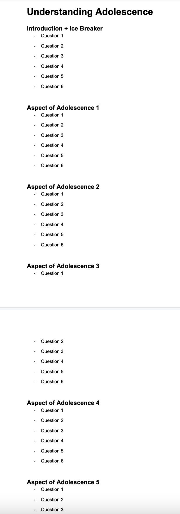
If you look at the nature of conversational interviews, as much open ended as they may be, you have a fixed set of things that you want to get out of an interview. Therefore, what we resorted to during an interview, was a tree diagram of sorts:
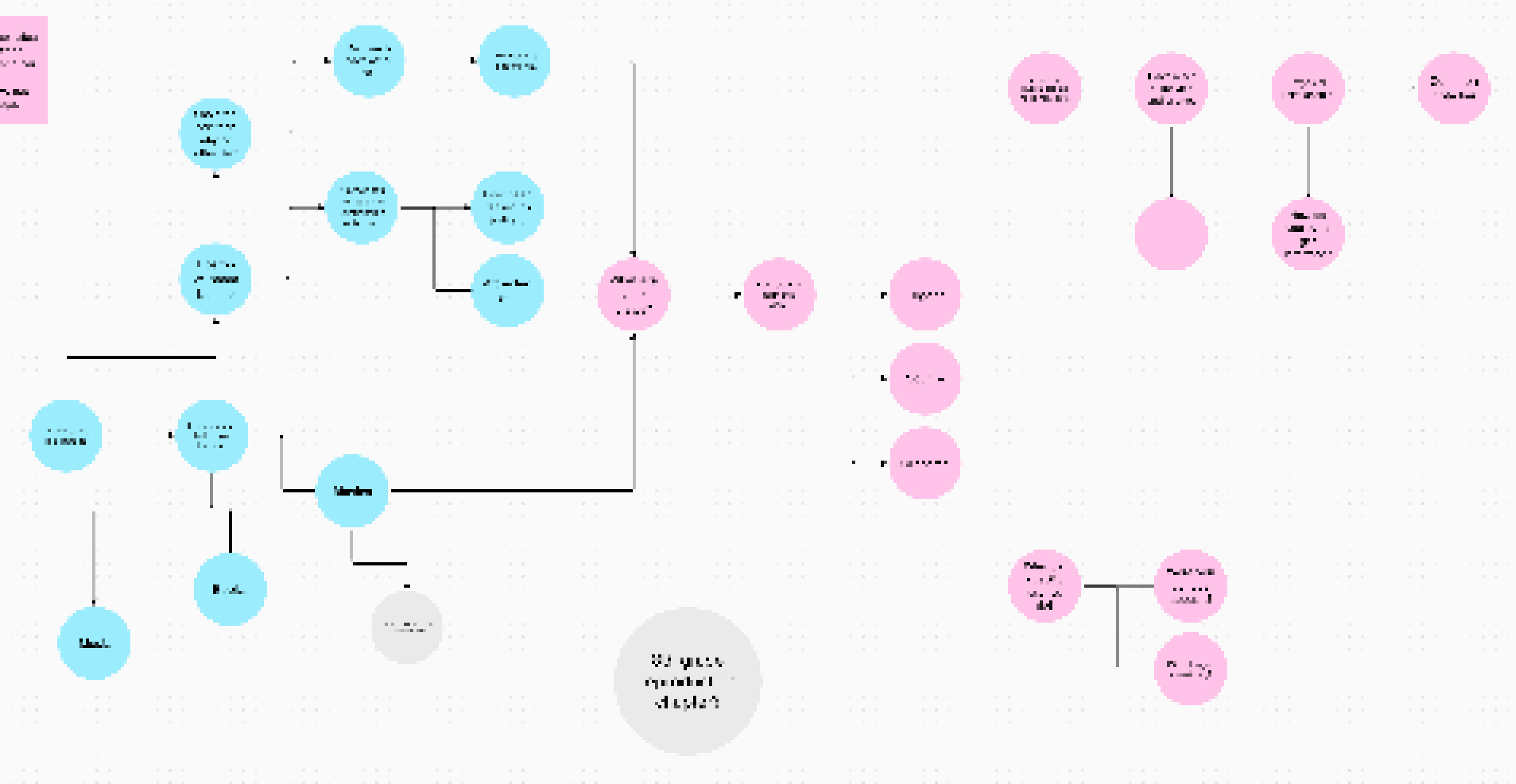
What helped was when a person opened up and started talking about their adolescent years, we were able to probe with the specific questions for that particular facet. For example, a person may share a long story with one mention of a relationship failure, and then deviated to other topics. For us, relationship failures was an important one and as soon as we caught on to the fact that there may be a relationship failure story (essentially functioning on keywords), we asked the necessary follow ups.
Furthermore, each follow up would have paths. For example, for a certain question the person may answer yes or no; and each of those cases would then have specific follow ups. Even furthermore, those followups may then have links to other topics and in this way you’re able to ensure that linked topics are covered and not missed out, as well as ensure that each of your facets are covered.
Questions will have answers and these answers you can usually predict by determining the nature of the question. Why not make full use of it and have “interview paths”, in order to add structure to what would otherwise be a loose open-ended conversation prone to certain points being missed out.
[Cool Projects] Analysing dialling sounds to obtain phone numbers.
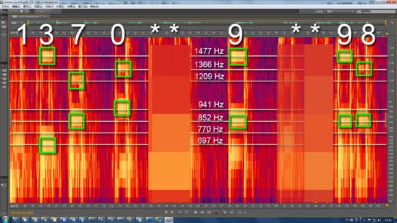
The premise of this project was quite amusing. A Chinese college student, Liu, decoded the phone number of Mr. Zhou (an IT giant’s boss) by simply analysing the dialling sound from a video in which someone made a call to Mr. Zhou.
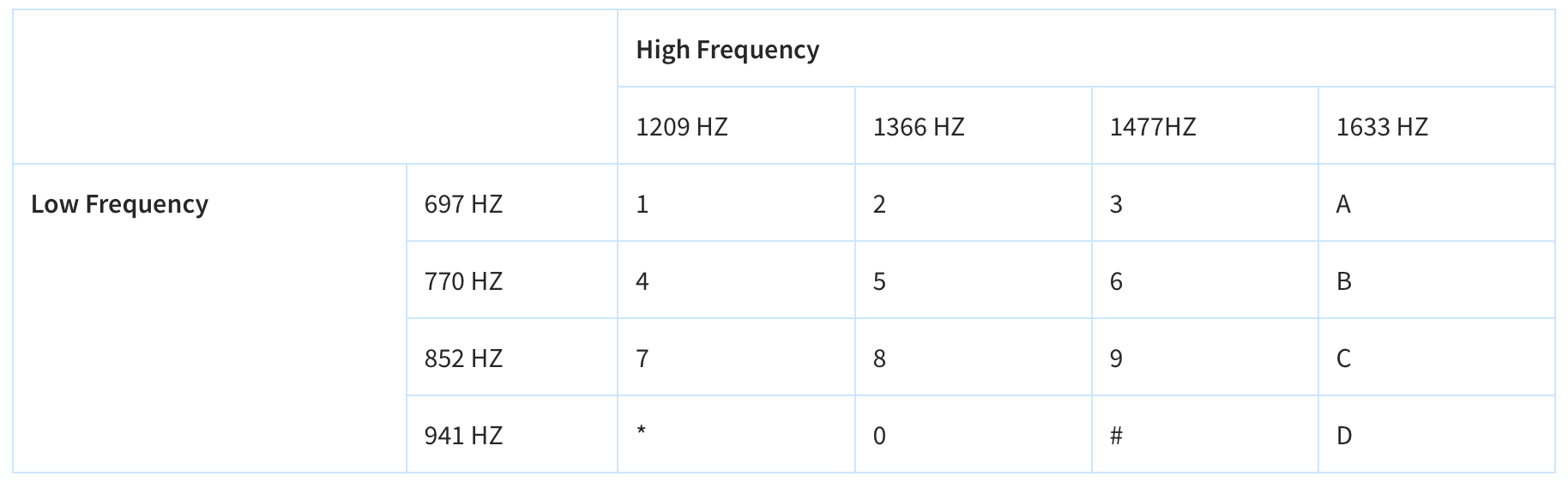
Sounds on a keypad are laid out on a 4x4 matrix, with each key having two frequencies (made possible by using Dual-Tone Multi-Frequency Signaling, or DTMF).
Liu then collected the dialing sounds from the video and changed it to another format (PCM, Pulse-Code Modulation) to then further analyse on an audio analysis software. His analysis finally revealed the actual phone number of Mr. Zhou.
What a cool side project! There are so many human-made things out there in the world that just go overseen, for example: how each number on your keypad has an assigned sound to it.
What I like about this project is exactly this: the keen observation and then, the clever reverse-engineering to arrive at an outcome AND highlight a security loophole. Great job, Liu!
[Terms] Neologism
While attempting to understand the math behind diffusion models, I stumbled upon this term called neologism.
This essentially means a new term, word, or phrase that has been coined and used but hasn’t fully been accepted into mainstream language.
Recent ones include adorkable (an adorable dork), anthropause (the global shutdown of travel and human activity), anti-vaxxer (a person opposed to vaccination) and many more found on this list.
[Projects] Visualising the rarity of side effects of the Johnson & Johnson vaccine.
This is such a simple, yet effective data visualisation project.
What Washington Post did is create a canvas that draws dots for successful vaccination and then included the actual probability of creating a blue clot (which stands for a blood clot) to show just how rare a blood clot may be, if using the vaccine.
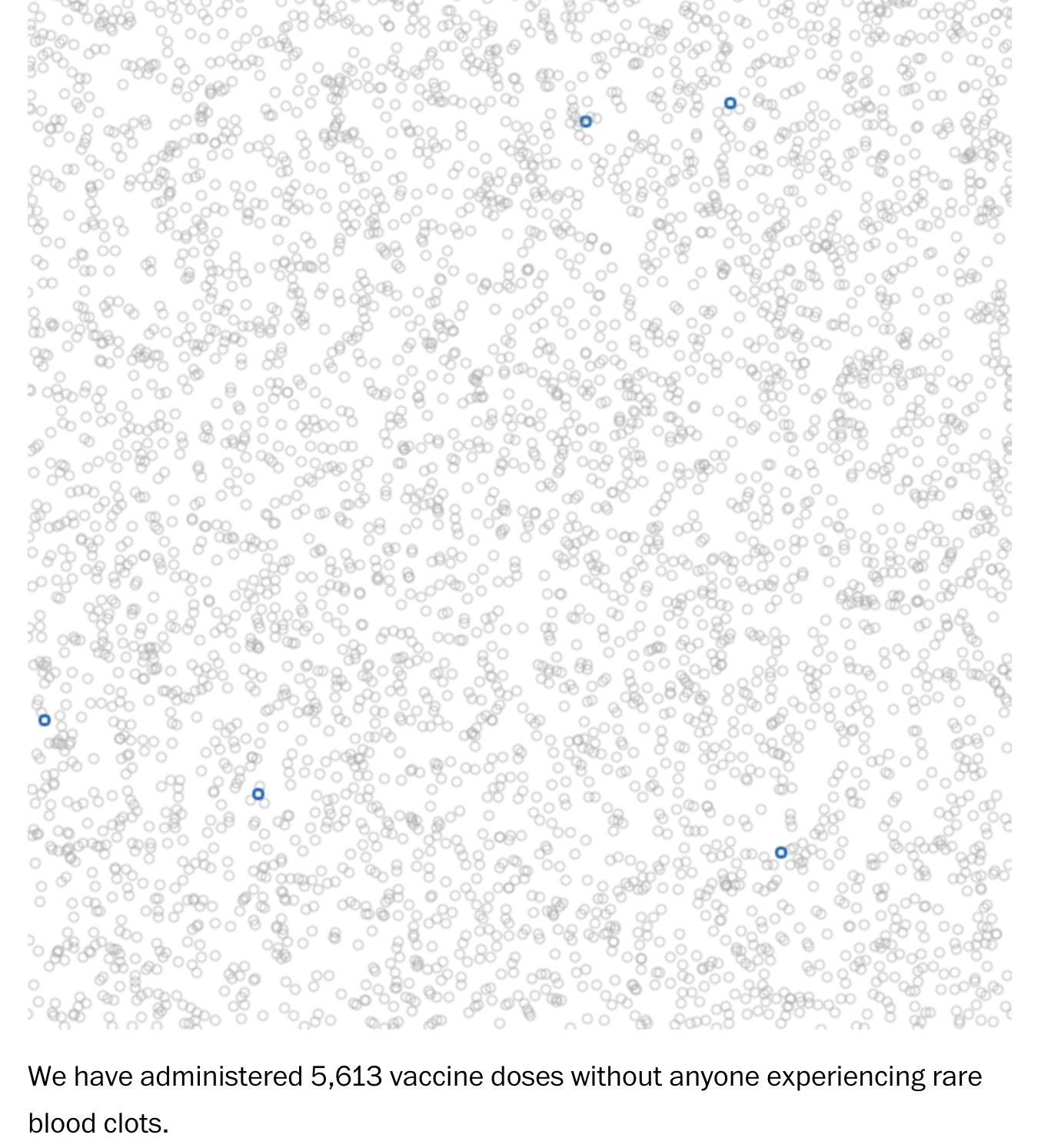
When you go on the article, the count starts with 0. Then, in realtime, it draws one dot per vaccine. As you spend more time looking at the visualisation, it keeps on drawing more dots (60 per second, according to my breakdown).
When I first looked at this, I realised how simple this was to build. I can probably code this in less than 45 minutes. And yet, when you put it in the context that it was intended for, it works so well.
This brings me to my takeaway from this visualisation: data need not be visualised in the most complex or intricate manner, which tends to happen with large datasets. All you need to do is communicate correct information in a manner that does justice to intent behind the communication.
[BE Principles] Normalcy Bias
In an interview with a high school student for one of our projects at TinkerLabs, she mentioned how her school and the environment around her tried to make her aware about the concept of menstruation but she never paid heed to it. Until the day her first period came, which then wreaked chaos as she had refused to prepare for it.
Normlacy bias is a form of cognitive dissonance, that results in the refusal to plan for, or react to, a disaster which has never happened before. People tend to disbelieve or minimize threat warnings and, overall, underestimate the likelihood of a disaster and its potential effects.
It was interesting to speculate how this cognitive bias, although studied in the context of more serious disasters, could have played a role in this woman’s life.
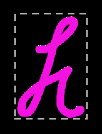
[Experiments] A smart algorithm to create bouncing type
I wanted to program a way to draw type on the screen that would then automatically move, with a speed variable acting on it.
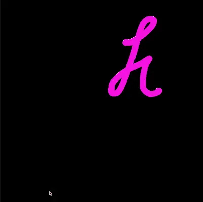
What this meant is that each brush stroke on the screen had to be aware of its position on the screen and if it’s going off the screen, it had to reverse the speed.
Now, in order to do this, the tricky bit was to identify the extreme pixels on each side; to create a bounding box.
But how does the computer understand the left-most, or the right-most pixel? Well, here’s a way I figured out.
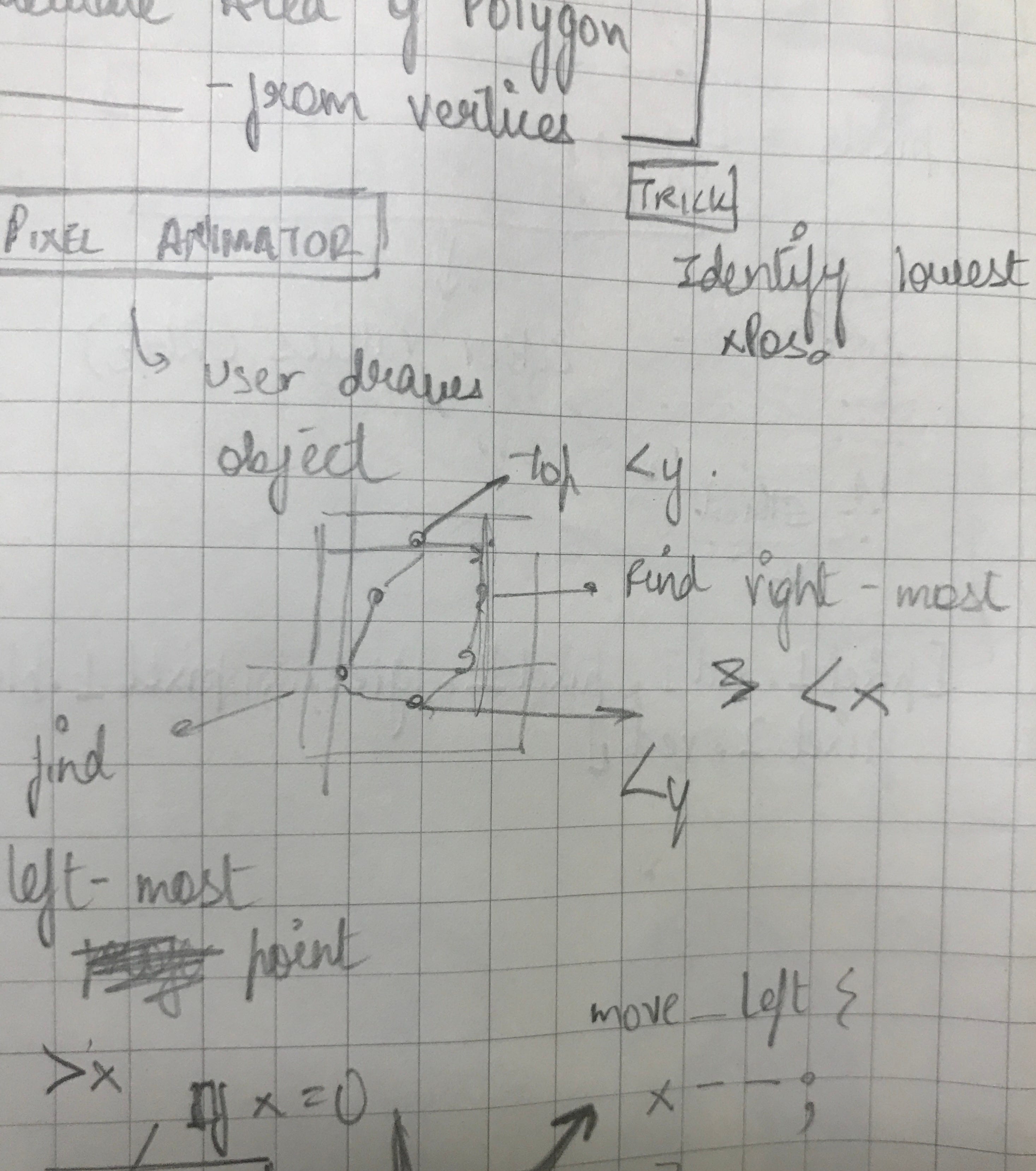
Each dot drawn has an x and y position. These x and y positions are first stored in two arrays (two lists, one of all x coordinates and another one of all y coordinates).
  let xPos = [];
  let yPos = [];
for (let i = 0; i<dots.length; i++){
    xPos.push(dots[i].x);
    yPos.push (dots[i].y);
  }
Then, you find the minimum value in the x array (this gives you the point closest to 0 on the x-axis, which means this is the left most point).
let leftMost = min(xPos);Then you find the index of the dot object that this value belongs to, in order to identify which exact dot is the left-most dot.
leftIndex = xPos.indexOf (leftMost);You can do the same for all 4 points. Maximum value on the x axis means the farthest point, closest to the end of the canvas and the same stands true for y values as well.
Then you can return these values to the function that allows your dots to move, which will have a speed variable and a position variable to add that speed to. The values you return are the minimum values and maximum values, which you can then cross check with your desired area (in this case beginning of canvas and end of canvas). If your left most point is lower than the left most point of your desired area, reverse the direction of all dots by multiplying the position with constant negative speed.
    if (leftIndex < 0 || rightIndex > width) this.xSpeed *= -1;
    if (topIndex < 0 || bottomIndex > height) this.ySpeed *= -1;
And this gives you a bouncing type generator!

[Conversations] The purpose of design for different designers
Although this demands a whole separate elaboration altogether, I think I want to end this article with this reflection.
In a conversation with one of my juniors, who’s pursuing her final project, we dived deep into what design means to her; by dissecting her thesis ideas. All this while, I had remained adamant on design being a problem-solving tool and being used to better the lives of the people of this world. You know, the standard make the world a better place hoopla.
For a long time, I rejected the idea of design being used as a creative outlet. Why should the environment of this powerful tool be used simply to express, that too to a group of privileged people who marvel at the act of creation and then walk back home to their glass windows; taking back nothing more than maybe a warm smile or a pleasant surprise.
But, honestly, who are we to make that distinction?
Yes, design is a powerful tool that has the ability to positively impact the lives of many people on this planet. The functional argument that is often interlinked with the explanation of design in the modern world is a strong one, but functionality, per se, is not just about whether an outcome is functional in the real world or not. Functionality can be a tenet in the creation process too and, maybe, that makes a creative outcome still be a part of the design world.
Confused? Let me elaborate one last time.
Think about the most abstract piece of art, something that you’d consider a strong argument against it not being “design”, since design is supposed to be functional and useful. That abstract piece of art is, in its own way, designed to communicate the feelings of the artist. It is designed to be useful in probably a rich man’s home. It is designed to evoke some sort of feelings inside you. It is designed to be interpreted, or misinterpreted, based on the artist’s own understanding of human beings (much of what designers tend to geek out on). This understanding is also developed by using research methods (observation, immersion, shadowing, you name it).
Heck, everything is designed and design could be anything. There isn’t a set number of people that an outcome has to affect, or a certain number of things that an outcome is supposed to achieve.