

Week 41
Week 41
Web typography research, making an audio-reactive letter, letters with mail, the infinity design framework, a film experiment and The Lonely City by Olivia Laing.

A pretty brilliant week overall. Got a lot of work done, especially on the personal projects side.
I believe that I have been able to operate in an almost equilibrium-like state, with a healthy mix of things that I want in my life. Ironically enough, when things go well for me, I immediately begin to prepare for the next adversity; almost awaiting it with a wary presence.
Anyway, let’s see what lies ahead. Here are my learnings and work from this week:
[Research] Web Typography Research
During the last week, I focused heavily on the typography of my portfolio (currently in development).

This included learning how to load custom fonts on CSS by using the font-face function, reading up about web standards and stumbling upon a goldmine titled Type On Screen by Ellen Lupton.
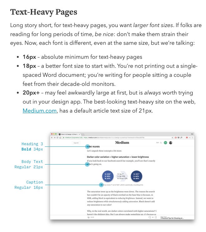
As for web standards, it is generally preferred to have a minimum font size of 16px. However, a lot of type sizing depends on the font as well. Some fonts with lower x-heights may become too small at 16px and, therefore, might have to be bumped up to 18px. I also understood what an em meant in web development. It’s a standard base size of 16px (1em) which you can then use as a mathematical progression (1.25em, 1.65 em, etc).
From Type on Screen (by Ellen Lupton), I had some very unexpected learnings.
Turns out that the logical tags while developing a website (h1-h6 + p) tell the browser that the text has special meaning and, therefore, search engines can use it to analyse content. I had not even thought about this.
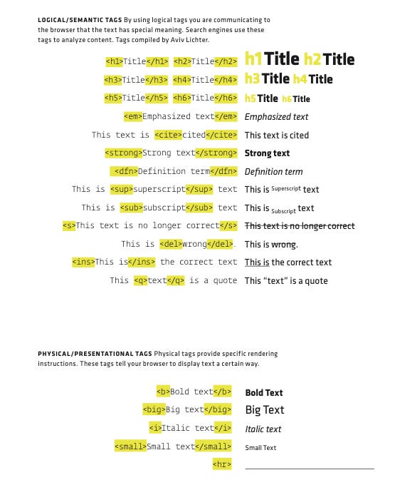
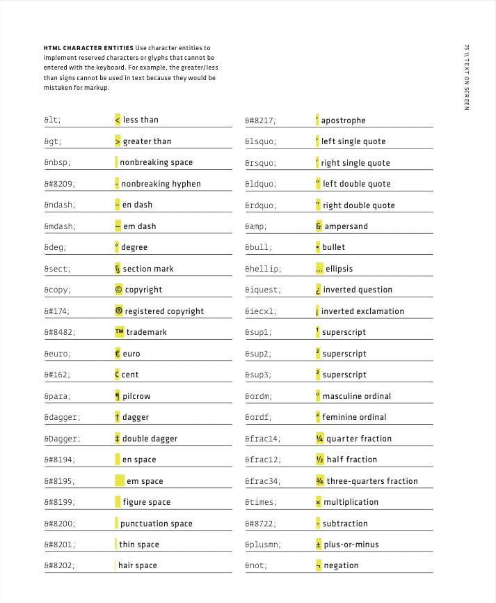
Furthermore, it turns out that you need to use HTML character entities for special characters. For example, you cannot use the greater than / less than sign (<, >) because they would be mistaken as HTML content (markup). Again, I hadn’t even thought about this.
Finally, the last piece in my typographic puzzle (which remains unsolved as of now) is the design of my body text. On smaller screens, a 16px paragraph (typeset in Atkinson Hyperlegible) works pretty well. However, on a 16-inch MacBook, centre-aligned text with comfortable margins feels too lost.
Based on what I had read, 45-75 characters per line seems to be the optimum line length. However, in my case, the line lengths exceed way above 45-75 characters. There are some ways to solve this:
Make the content crisper, so that it does not end up being long-form reading.
Make the margins tighter, so that the text box occupies lesser space.
Increase the font size and leading (18px with 135% maybe?)
Change the colour scheme from white on black to black on white.
Change the font.
Create a more complex layout with two-thirds of a section occupied by text, while the other one-third has images / other content. This is something that Gwern’s website does really well.
Right now, I’m still at a standstill and have moved on to fixing some of the other things on other pages. I will come back to this, I don’t quite know my answer for this problem yet.
Maybe it’ll come to me, when that’s the only problem left to solve against a tight timeline.
[Experiments] [Collaboration] Audio Reactive Letter
After my workshop at MIT-ADT, an attendee began using creative coding for her 36 Days of Type project. We had discussed some code problems in the past and decided to collaborate on the final letter ‘Z’ for the project.
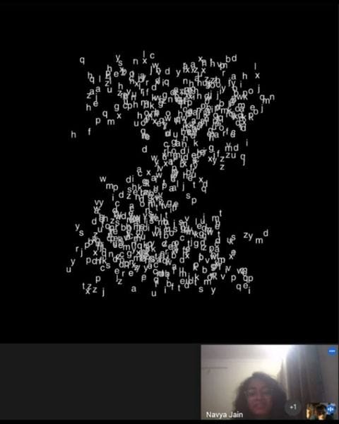
We ended up making an audio-reactive ‘z’ that is formed by moving particles (which are other letters). Every time that there is noise beyond a certain level, the particles snap back to form a Helvetica ‘Z’; otherwise they move around freely, bouncing off the edges of the canvas.
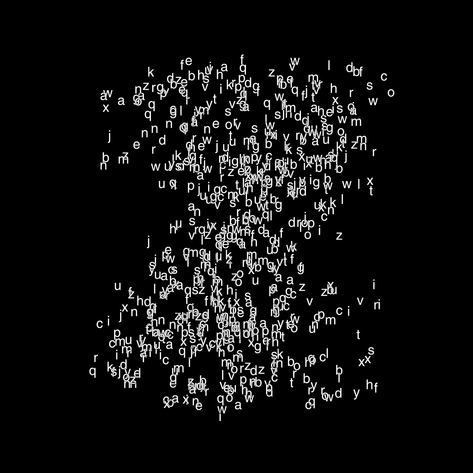
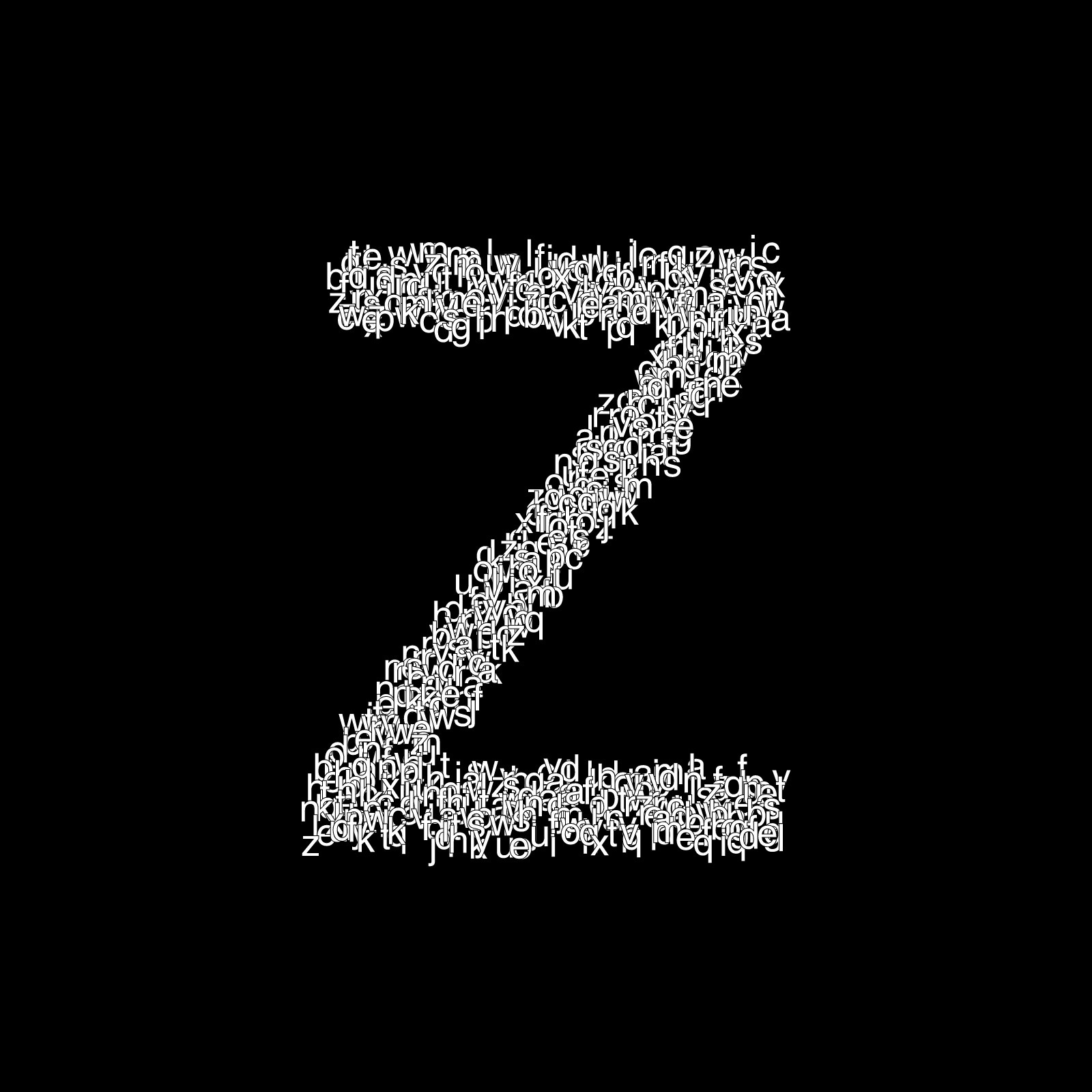

I wrote the audio-reactive algorithm and made the particle system while Navya worked on the casing of the letter ‘Z’. Funnily enough, it took me just 24 minutes to write everything from scratch.
Navya’s approach to the casing was different than what I had expected. We had earlier discussed the creation of 3 rectangles, which would have been a simple way to do it. However, she was struggling a little bit and found a piece of code on the internet. It used a rather unexpected way of solving the same problem.
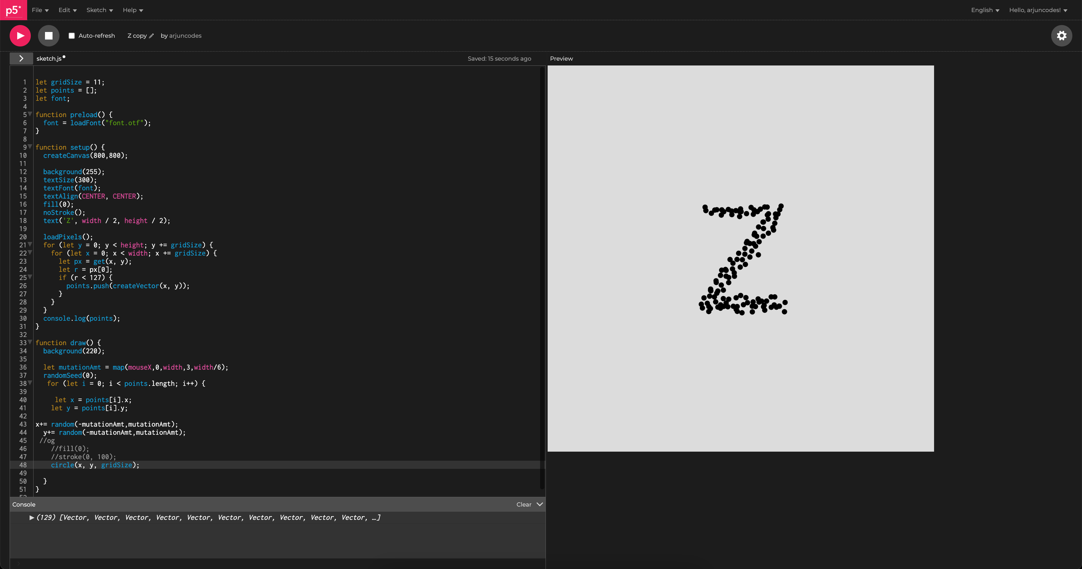
What the creator(s) of this program ended up doing was drawing a black letter on a white background before the sketch starts and then storing the x & y coordinate of each black pixel. What a cool approach!
This entire journey to make the ‘Z’ with Navya (while figuring out what this program was doing) has given me new ideas to play around with typography on p5.js.
[Reading] The Infinity Design Framework
I was reading up on the work of Sree Mahit Munakala, someone who studied HCI at Carnegie Mellon. In one of his academic papers, published in Design for Tomorrow – Volume 2, he talks about the infinity process (a proposed design framework).
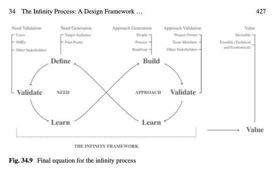
I mean it isn’t groundbreaking or anything, maybe even exaggerated for recognition to some extent, but I found the approach quite cool. When you’re explaining the design process to UX students, you may be so engrossed in the industry standard terms that they forget why they’re really doing something. Stuff like HMW statements, pain points, etc can just be summarised in simple words. Define a problem, or a need and then go out to validate it (encompasses all research, analysis, etc).
I think the framework provides a good macro picture of problem-solving with design and also emphasises the fact that it’s a continuous loop.
[Cool Projects] Type of Letters
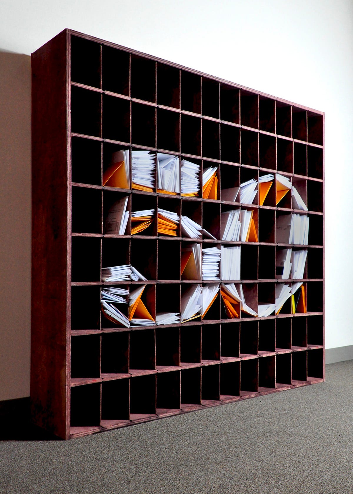
He built a mail shelf and used letters to create typography.
[Filmmaking] Water & I
After my attempt on filming every day for a year and making a film out of it every month, I had decided to make a grand film of sorts; something that uses the 1100 shots from last year that I have accumulated.
However, it is May right now. For months, I have tried to sit down and begin working on the film, but got up instead because of the overwhelming workload that awaited.
Filmmaking is tough. It takes a lot from you and I don’t think I have the kind of bandwidth to make my ever-so-glorious short film that will take me places. Instead, I decided to just mess around with some sequences with an overarching theme.
For this one, I used shots of water, people & me.
I am happy with my experimentation. Someday, I will have the time to work on the grand film or I might just make so many sequences that they can finally be combined into a larger one.
The second option feels more likely.
[Reading] The Lonely City by Olivia Laing
Been reading The Lonely City by Olivia Laing. Fantastic discourse on loneliness in big cities, viewed as a distinct feeling and not an outcome / cause for something else. Here are some lines that I really liked from the book:
“Statements like this have a more than casual link with the belief that our whole purpose is as couple creatures, or that happiness can or should be a permanent possession. But not everyone shares that fate. Perhaps I’m wrong, but I don’t think any experience so much a part of our common shared lives can be entirely devoid of meaning, without a richness and a value of some kind.”
“Loneliness inhibits empathy because it induces in its wake a kind of self-protective amnesia, so that when a person is no longer lonely they struggle to remember what the condition is like.”
“I remembered sitting, years back, outside a train station in the south of England, waiting for my father. It was a sunny day, and I had a book I was enjoying. After a while, an elderly man sat down next to me and tried repeatedly to strike up conversation. I didn’t want to talk and after a brief exchange of pleasantries I began to respond more tersely until eventually, still smiling, he got up and wandered away. I’ve never stopped feeling ashamed about my unkindness, and nor have I ever forgotten how it felt to have the force field of his loneliness pressed up against me: an overwhelming, unmeetable need for attention and affection, to be heard and touched and seen.”
A definition of loneliness: “the exceedingly unpleasant and driving experience connected with inadequate discharge of the need for human intimacy.”
“whose courageous, extraordinary body of work did more than anything to release me from the burden of feeling that in my solitude I was shamefully alone.”
Wonderful read and a fascinating take on the subject.