

Week 32
Week 32
Luminiferous aether, co-creating with ChatGPT and why it sucks, word portraits by Phil Vance and 1 dataset but 100 visualisations by Ferdio.

[Learnings] [Experiments] Luminiferous aether
For a long time, the word ether kept appearing back in my life. A strange, unused word that has found its way back into popular culture through the romantics that employ it. Very interestingly, a line in the book Alone With You In The Ether reads, “When you learn a new word, you suddenly see it everywhere”; which is certainly true in the case of the word ether for me.
While an ether, today, refers to a class of organic compounds that have an oxygen atom bonded to two alkyl or aryl groups, authors and songwriters are referring to the ether as a space, which is technically known as a luminiferous aether.
Till the late 1700s, it was believed that the world contains luminiferous (or light-bearing) particles because of which light is propagated across the Earth. By the 1800s, the scientific community moved towards the suggestion that these weren’t particles but waves; with the Earth moving into these waves all the time. However, when Einstein published his special theory of relativity and proved that the speed of light is constant, it was evident that light was not travelling through these particles or waves since that would’ve led to a drag (known as the Aether Drag hypothesis) due to the Earth’s constant motion.
The concept, however, of a space where humans move into millions of light-bearing particles was a beautiful thought. I decided to combine the idea of the ether being both, a system of particles moving in a wave-like motion by building an attractor system.
On this canvas, if you move your mouse around, particles will swirl around you in a wave-like format. I later overlaid this on top of lyrics from the song Into The Ether by Leif Vollebekk.


It would be interesting to use this particle system as actual ‘light-bearing’ particles on a webpage. Discover content only if the particles are on top of the content. Interesting navigational idea. I might build it.
[Reflection] Co-creation with ChatGPT and why it takes the fun out of it
I hadn’t particularly gotten interested with ChatGPT until this week when I wanted a second opinion on a piece of content that I was writing.

I was surprised at the outcome. I then decided to mess around with it to see if it could program as well and sure enough, it could spit out complex programs in a matter of minutes.
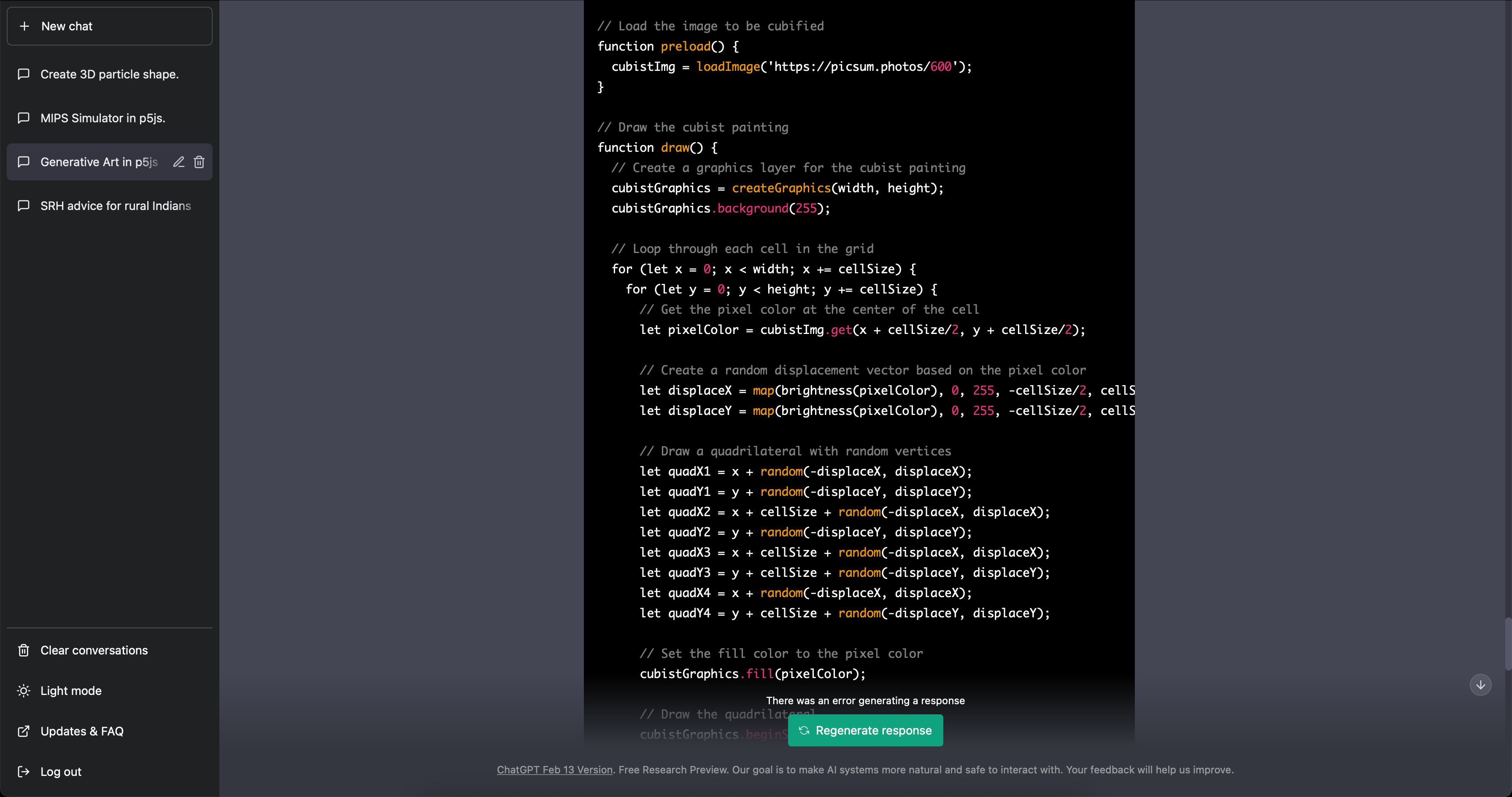
For a while, I tested all the ideas in my backlog. ChatGPT could churn out my ideas a lot faster than me (with me editing a lot of it to suit my style, of course). I decided to use it to my advantage; to make it write all the boilerplate code that I didn’t want to waste my time writing, i.e providing a structure for me to then finally tweak to suit my liking.
I made a couple of things using this process.


When I did, I realised how it took the fun out of it for me. When I program an idea from my head, the fun lies in the creation of it; the racking of my tiny brain to figure out the logic, feeding the computer algorithms like baby food and checking whether something is not working at every step.
That is where the fun was for me, as an artistic and explorative practice. It was never about the outcome but the process of arriving at the outcome; and within it, making sense of the world around me in a language that I love & understand.
ChatGPT will always be a better programmer than me … but it’s never been about the programming.
[Projects] In Their Own Words – Word Portraits by Phil Vance
An extremely cool project by Phil Vance that I stumbled upon this week. He creates portraits of people using lines that they have written / spoken.
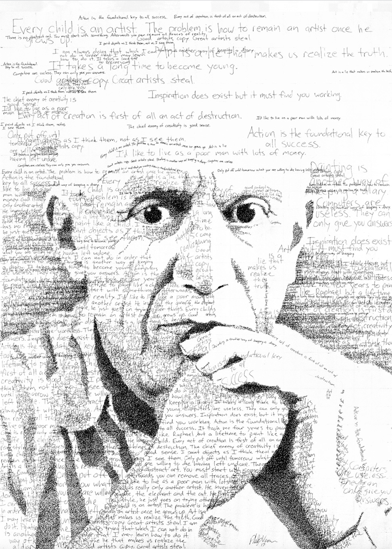
Very interesting juxtaposition.
[Learnings] Working Memory
This past week, I did a lot of reading about working memory for a problem at work which required me to determine the adequate number of options for someone using a product.
In UX, Miller’s Law has become an almost unstated standard. The summary of it being that the average person can keep 7 (plus or minus 2) items in their working memory. However, working memory is more complex than that.
In an interesting paper titled The Magical Mystery Four: How is Working Memory Capacity Limited, and Why? by Nelson Cowan, he highlights how the items being remembered also have an impact on their remembrance which is also dependent on the person’s relationship/familiarity with the objects.
In his paper, he highlights how the team has been able to arrive at the conclusion that young adults can recall 3-5 items presented from a list, even if they are single words or pairs (assuming that the words are familiar to the people). This is true for adults as well.

This is interesting because we never really take into account the fact that new knowledge might be harder to retain and, therefore, Miller’s Law (giving 7 options) is technically a cognitive overload for the person. 3-5 could be a safer bet. 3 could be an ever safer bet if it’s a long piece of information that a person is processing for the first time and then needs to choose (after comprehending new information); which is exactly the problem that I was tackling at work.
However, we didn’t go the fewer options route. We stuck to 7. I don’t agree with it but work in the real world has business agendas to meet as well. It’s a constant tradeoff, are you with the person or are you with the person or are you with both, thereby compromising both?
[Projects] [Thoughts] 1 Dataset, 100 visualizations
1 dataset, 100 visualizations is a project by Ferdio, an infographic and data visualization agency in Copenhagen.
The project by itself wasn’t particularly fascinating but the thought behind it was admirable. Here’s their take on it (sourced from their webpage):
Every time we turn a set of data into a visual depiction, hundreds of design choices have to be made to make the data tell the best story possible. Many of the choices are unconscious, often resulting in similar solutions. The obvious and uninspired. This project goes beyond common solutions and best practice. It demonstrates how even the simplest dataset can be turned into 100 proper data visualizations telling different stories, using very limited visual properties and assets.
It just shows the amount of divergence that a simple visual outcome can possibly experience. A hundred ways to see the same dataset … isn’t that incredible? I wondered if they could find the diamond within these 100, a clear favourite; something that works well for them. However, there’s no documentation of it by Ferdio.
I think this is a good idea for a design challenge. Take something so simple, something that you think you can sketch out on a piece of tissue paper and then do it every single day for 100 days. It’s a very reaching-the-depth kind of process and I wonder what lies after it; after you’ve reached the ocean bed.