

Week 30
Week 30
A reminder to not rely solely on theoretical knowledge, creating a perspective calculator, math in visual arts & UX Stack Exchange.

I write this rather short article out of a guest room at IIM Indore, where I’ve come to conduct a workshop. I am distracted by the city around me and will have to limit the things that I put in this week’s post, simply because I am running out of daylight in such a pretty place.

Here are some thoughts that I managed to develop on the flight here:
[Experiences] [Learnings] Why you cannot rely solely on theoretical knowledge
This week, we spent our time synthesising data collected from the field (something that I’ve written about in the previous post).
Before we went on the field, I was struggling to come to terms with the reasoning behind one idea. It was essentially a method for users to ask questions on a chatbot by using a series of funnelling steps, like an index of sorts. The other method to achieve the same task? Ask a question directly.

Which method do you think is easier to use? Method 1, right?
When you look at both methods theoretically, you can instantly identify a list of problems with Method 1 (top). Number one: choice overload (too many choices for a user to choose from as options ranged anywhere from 3-12. Decision making issues such as decision fatigue (taking more decisions leads to increased fatigue with each decision), decision paralysis (too many choices that are difficult to compare and, therefore, choose from), and even intuitively as a UX designer, you can possibly conclude that Method 1 has too many steps in comparison to Method 2.
However, when we went on field, we realised that this wasn’t the case.
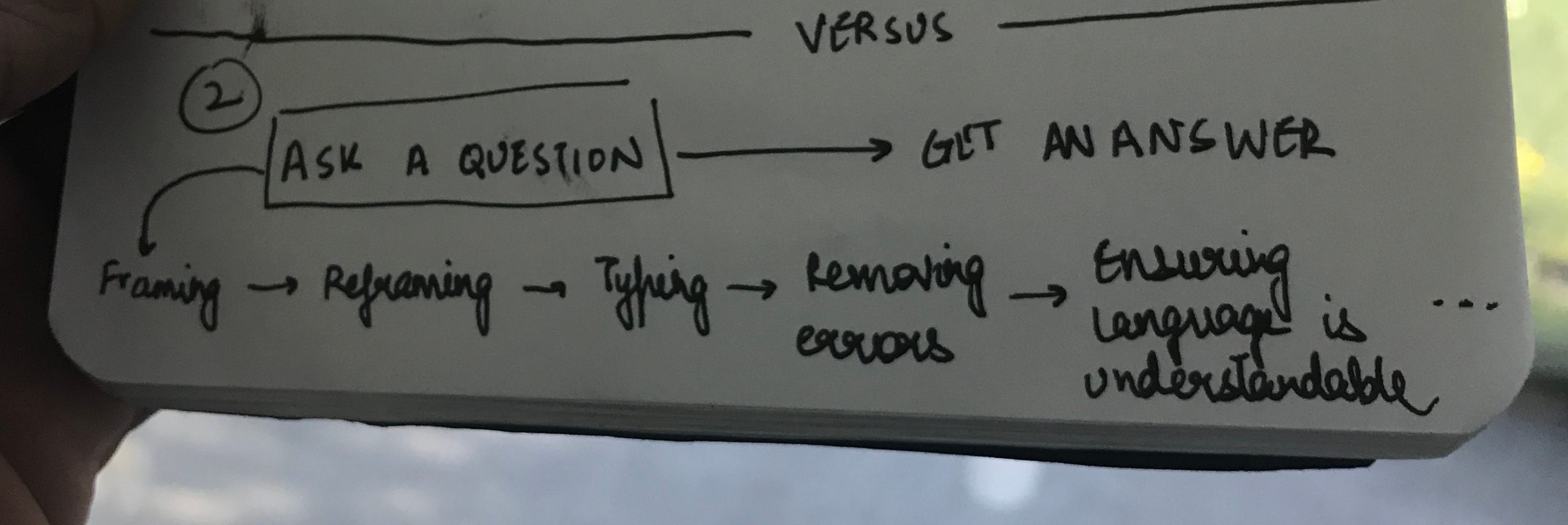
Method 1 actually has quite a number of underlying steps that I had personally missed. Asking a question requires you to think of something, phrase it, analyse whether it’s phrased correctly for the person on the other side, physically type it with multiple presses of letters, send it and then finally wait for an answer. On the other side, it’s a simple & fast selection from a limited number of options.
When I came back from the field, I felt humbled by this experience. As makers sitting in a privileged position in the maker-user paradigm, we often generalise a lot. I could never have known that asking a question would actually involve more number of strenuous steps than choosing from a list. I don’t think I could have ever known, had it not been for the visit on field. And to think about the fact that I wanted to not take this idea on the field because I could come up with a bunch of theoretical arugements against it is a reminder for me to take a step back and accept how privileged we are as makers of a product.
Pratyush has been right all along, who was the only advocate for this idea. Let the users make that decision, not you.
[Experiments] Creating a perspective calculator
The week before the previous one, I also had the opportunity to visit the Madhya Pradesh Tribal Museum in Bhopal. It was a beautiful experience.
In particular, I was intrigued by a detail in their paintings.
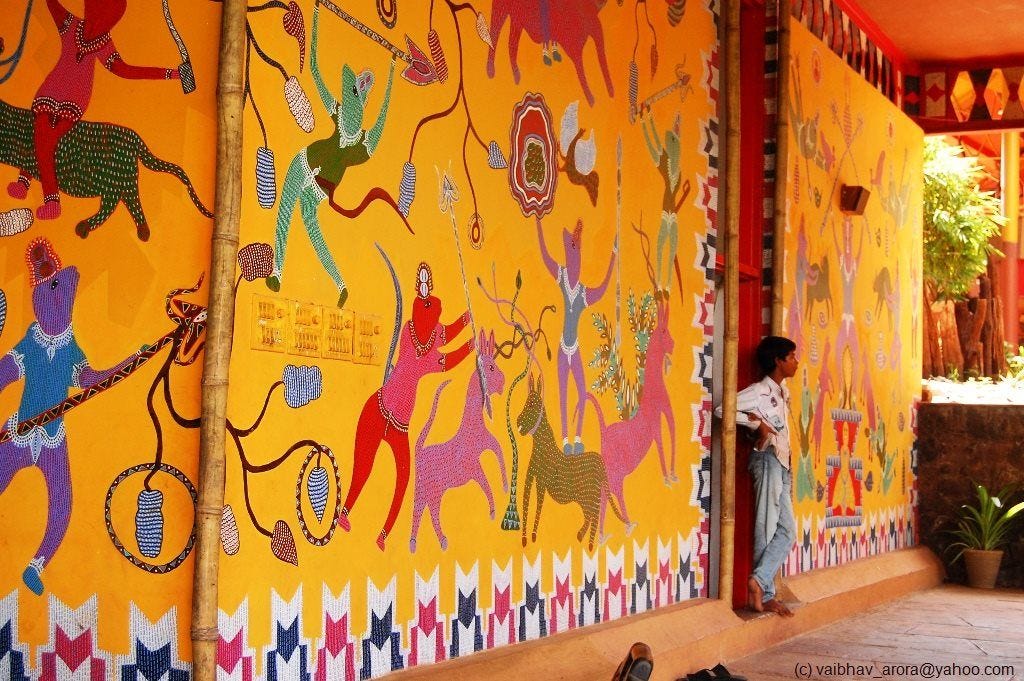
If you look at the creatures controlling the animals in the photo above, you will notice tiny strokes of black inside that dictate a certain flow of hair/fur (depending on the character) of the organism.

I found these to be utterly fascinating. If you draw a parallel to Van Gogh’s inclusion of turbulent flow in Starry Night, I am convinced that there is some understanding of ‘flow’ in these characters as well. If one is to conduct a mathematical analysis of the curves, like how smoothly they transition over a piece of the character like his leg, for example, in the image above, I am sure that there is something very concrete and planned that lies underneath which you can connect to a mathematical concept.
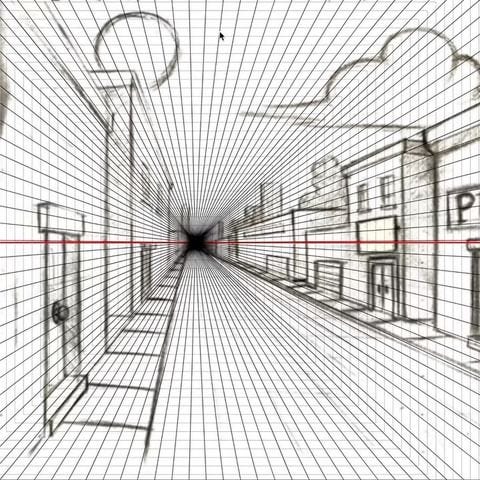
Exploring this line of thought, I became fascinated with trying to create tools to analyse artworks. The first thought that I had was to create something that could deconstruct the grid of a given artwork. I thought of the simplest kind for now, one-point perspective.
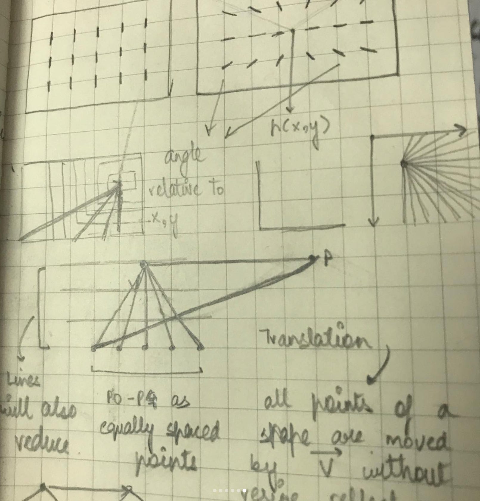
The tool I made essentially involves a moveable point (which also determines the line of vision). Once you click to set it, it creates a number of concentric lines that join at the vanishing point. A person can then move their mouse up or down to determine the number of lines (i.e, form a grid over a piece of artwork).
An example is shown in the video below:
Next, I want to work with more organic grid structures. What if you could select parts of an image and the computer could analyse their relationship with each other and result in a grid system that the image (a typographic poster, for example) is based on?
An exciting space to be in. I am also intrigued by the idea of analysing art and connecting it to scientific/mathematical principles, things that aren’t extremely evident but form a strong backbone for the outcome.
[Resources] UX Stack Exchange
I first came across UX Stack Exchange when studying about the problem of choice in UX.
UX Stack Exchange is basically a forum for UX geeks to ask questions and browse through answers that are largely related to User Experience Design. What I find mildly amusing is how the questions are answered as if they were a mathematics or programming-related question (like on Mathematics Stack Exchange or Stack Overflow).
Nevertheless, it is a good place to see how other people think about some UX design problems of our time.
[Reading] Hyperbolic tiling in Escher’s art
I read a pretty interesting undergraduate paper titled, An Exploration and Analysis of Mathematics As A Tool In The Arts, by Samantha Meek at Saint Martin’s University.
In one of the sections, Samantha discusses how a mathematician (Professor H.S.M Coxeter) helped Escher (a visual artist) construct the base for one of his woodcuts to portray a three-dimensional world in a two-dimensional piece of art by using hyperbolic geometry.
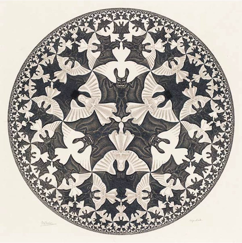
I don’t fully understand the mathematics behind it yet but from what I gather, they used something called a Poincaré’s disk to create hyperbolic lines. Essentially, it is an infinite disk that allows you to create segments by joining two points together. Since the disk is infinite, the further aware you move, the segments actually become longer and longer since more distance is in between them.
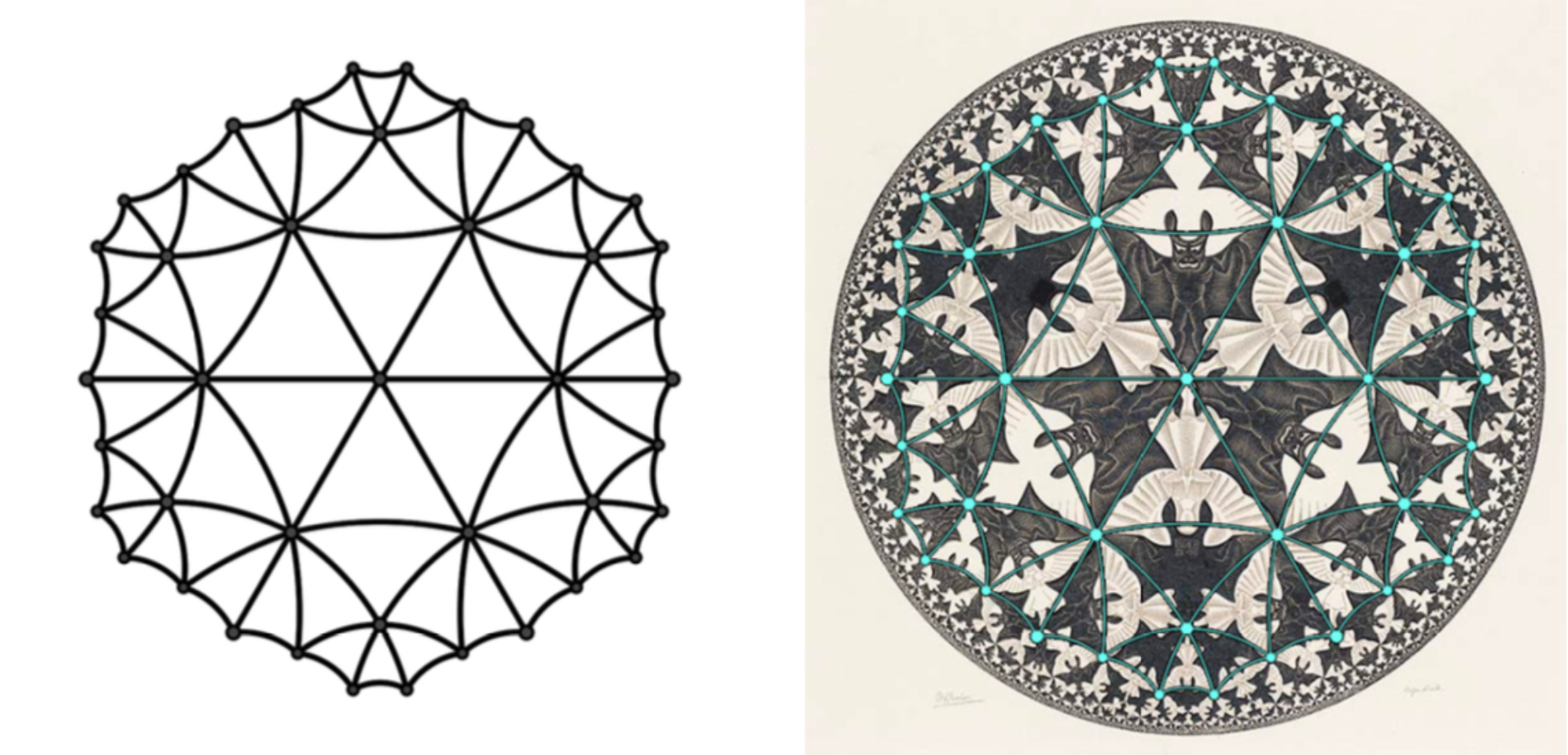
The math by itself isn’t fascinating to me, mostly because I cannot understand a large part of it. But what is fascinating to me is the precision with which Escher used this concept in his artwork (image on the right). I’m very intrigued with the concept of using a mathematical concept (such as this one) and producing art with it. How incredibly beautiful that there is this complex system at play behind a single piece of art that is invisible to the naked eye but makes complete sense if someone were to break it down into something like numbers.
I have more things to write about but I find myself distracted by the place that I am in. Things will just have to wait until next-to-next week :)